Designing a User Interface for Critical Tasks

Article by Ayana Campbell Smith — Jan 17, 2024

Designers spend a lot of time “inventing” interfaces. The results are a marriage of best practices (always in motion), trial and error (if there’s time), and intuition (stemming from experience). The lack of a consistent, “prescribed” way to design means that we’ve all run into apps that felt a bit hostile —repetitive, deceptive, unintuitive, overwhelming, and a host of other negative traits.
Design sounds like a fluffy, coat-of-paint sort of exercise. “Art.” UI and UX, though, shift the focus from promote and persuade to operate and manage. Insurance, healthcare, finance; heck, even ordering groceries is an absolute must for some. There’s no question of form versus function. It’s function or failure.
What does “critical” design look like? Instead of engagement-focused software, let’s talk about platforms that users rely on, but want to put down as fast as possible.
Balancing Design’s Opposing Forces
With form versus function out of the way, we’re left with the core struggle for critical applications: productivity versus process. Is it better to be speedy or safe?
Most of the tenets we’ll cover aim to find a middle ground.
Unobtrusive Help
With each feature, we’re weighing whether users are being supported or impeded — and how bad things could be if the guardrails went away. Should an unskippable guided tour be mandatory, or should help be an on-demand thing? Are there regulations or laws to consider?
There’s a catch when you add extra steps, too: They won’t be appreciated before they actually save the day. Something like a confirmation pop-up is an annoyance until it rescues important data from being deleted.
Less Art, More Psychology
“Inventing” an interface doesn’t (usually) come with unbound creativity. You could do whatever you want — a button that looks like a vertical light switch, a new three-finger touch gesture, etc. — but is it better to be unique or predictable? Users show up with existing expectations and familiarities. Carefully consider whether there’s added value in an unusual design decision and what it’ll take for a visitor to adapt.
Supporting Power Users
There’s one more umbrella concept to cover: power users. These are the day-in, day-out folks who rely on the platform for their job or wellbeing, and they’ll know the interface as well as your team does. If someone’s using the same feature 100+ times a day, small improvements can make a big difference.
The rest of these tenets have a healthy undercurrent of power user support. They aren’t the only kind of customer you’ll need to consider, but they’re an important one.
Critical User Experience
Productivity versus process, unique versus familiar, frequent versus new. Now that we’ve set a framework for thinking through design decisions, let’s take a look at UX needs for critical applications.
Working in Bulk
Lists and tables take up a healthy portion of the software we’re discussing. At scale — both by number of items and the number of times they’re viewed — managing more than one record at a time is a must-have. Imagine cleaning up thousands of photos, one by one.
The same idea rings true for data entry. Adding one user at a time is fine if there are five; it’s less tenable if there are 3,000.
A Healthy Amount of Friction
Repetition breeds complacency, and that’s less than ideal when we’re handling sensitive data and workflows. Adding friction can snap users out of an autopilot-like stupor.
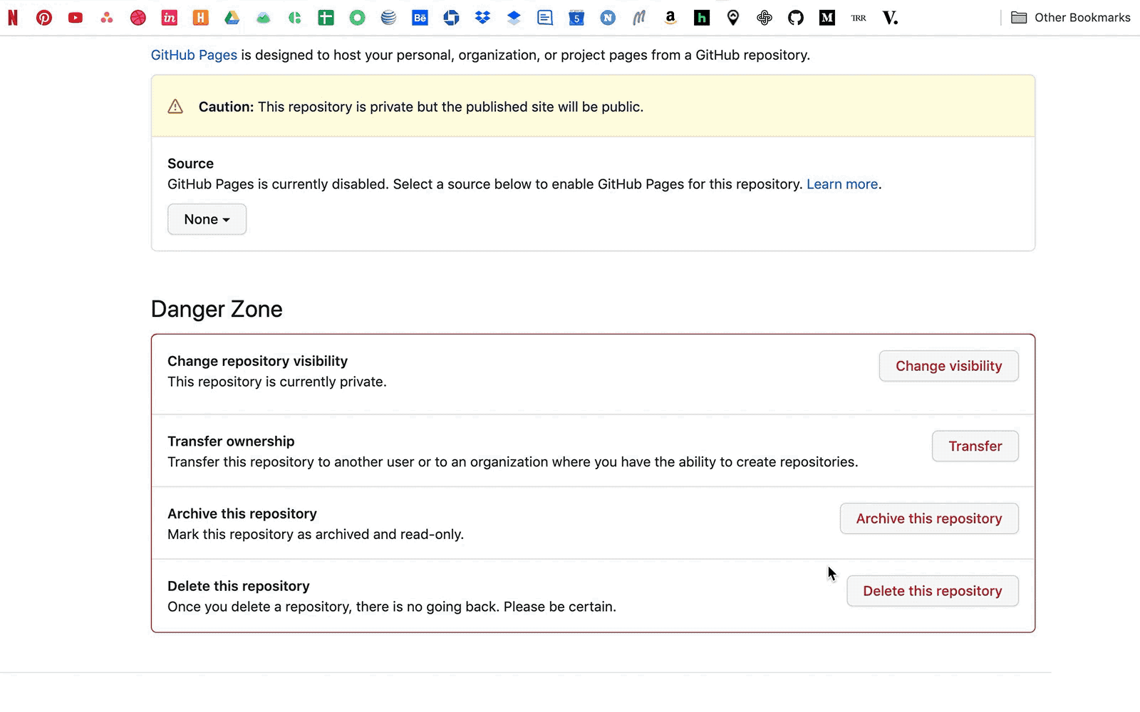
We’re back to the question of how much hand-holding makes sense. It’d be silly to require an extra confirmation when adding a table row, but it’s a reasonable feature when someone tries deleting 100. When do we save customers from themselves? How hard is it to deal with the fallout if we don’t?
GitHub’s 3-step repository deletion process offers a perfect illustration:
Continuity as a Core Tenet
People don’t like change. The excitement of new and shiny may tide them over while they’re learning your product, but updates will be met with skepticism. Design isn’t forever, though, and there are ways to help mitigate a looming change:
- Share your plans: compositions, roadmaps, progress, and the like.
- Give users a chance to offer feedback (and listen to it).
- Tap customers (especially power users) for testing.
- Communicate, communicate, communicate. Explain what’s happening, why certain paths were chosen (or not), and what’s next.
We’re not advocating for a shift to design-by-community; it’s simply vital that they feel heard.
Intelligent Defaults
Maturing products tend to have more — more settings, more dials, more knobs to tweak. Fine-tuned control is great, but not for everything, everywhere, all the time. Keep forms and settings pages tamed with smart defaults, and the ability to opt-in to advanced fields when they’re actually necessary.
Trusting Visual Feedback
What users see should be what they get. It’s a no-brainer, sure, but how often do you wind up doubting what an application is showing you? The page says I’m in line to purchase tickets, but it’s been a while. What if something went wrong?
Ideally, feedback to the user should be clear, concise, fast, and accurate. Trust is hard to build and easy to lose.
Critical User Interfaces
The line between experience and design is a thin one, but we’ll hop over it now to talk through UI-centric concerns for critical software.
Taking Yourself a Little Seriously
Designing an “important” interface doesn’t mean it needs to be the software equivalent of business casual, but it should take itself a little seriously.
Cute illustrations and copy have their place. Materials around marketing, promotions, and positive status all support a fun brand approach. When it’s time to deal with an error, issue, or negative feedback, though, cute feels belittling and dismissive. “Oops, someone’s monkeying around with the servers!” paired with a character drawing doesn’t work when you’re filing taxes.
Color and Typography Baselines
Nailing color and typography is key to every design, but we’d be remiss not to mention them. There’s a time and a place for bright colors and decorative fonts; that place usually isn’t in your process application. Usability is better than enforcing your neon yellow brand color.
Critical interfaces should meet the normal baselines, of course: contrast, hierarchies, spacing, and so on. Modes and themes (like a dark mode) have an added importance in helping combat eye strain for all-day users. “Comfortable and clear” is the place to build from.
Writing for UI
Copywriting for the web is a field unto itself. Designers are relied on for the basics, though, so it’s worthwhile to have a handle on ideas like:
- Strive for everything to be as concise as possible
- Pretend that instructions and long blocks of copy will be skipped
- Accessibility adds to the list: alternate text for images and icons, clear descriptions of status and errors, and so on
- Buttons should be labeled with the action they’ll actually perform
- The amount of words or characters may change dramatically in a translation
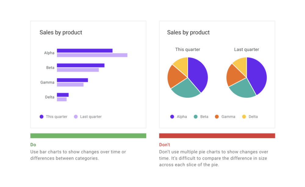
Visualization Basics
Data visualization is often a nice-to-have masquerading as a need-to-have. They’re flashy, look great, and give a product an air of authority.
Whether you’re adding a visualization or advocating against their inclusion, it’s good to pick up the basics around chart options and literacy. Like copywriting for the web, picking a chart and making it interactive are full-fledged areas of study. Critical software lends itself well to trending data, which in turn lends itself well to visualizations, so they’re an ever-present possibility.
Google’s Material Design data visualization guidelines offer excellent advice for creating visualizations that are accurate, helpful, and scalable.
Dense, but Not Too Dense
Information density is firmly rooted in that balance between infrequent versus power users. Is it more helpful to limit the number of items on screen and help someone stepwise through a task? Or, should as much information be fit on the page as possible?
Depending on your appetite for supporting a wider array of interfaces, there are ways to bridge the two:
- Allow users to adjust details like whitespace and visible table columns
- Progressively add more data as a new user gains competence
- Provide modes (think pro versus hobbyist) for customers to select from or pay for
Animation and Delight
Motion design (also its own field of study) helps with clarity, feedback, and (honestly) makes a platform feel much more polished and trustworthy. In the realm of repetition, though, waiting on animations shouldn’t be an affliction for power users.
A one-second delay while a to-do item fades off into the distance doesn’t seem to bad — until it happens 500 time a day. Following along with “Taking Yourself a Little Seriously,” motion and delight shouldn’t be a net negative.
Closing the Loop with Testing
We’ve talked through best practices and best guesses, so we’ll close with some thoughts around trialing these tenet-following designs.
Stakeholder Experts
Everything’s easier when domain experts are part of the acceptance team. If neither the designers nor stakeholders have power user prospects, there’s a lot more testing, feedback, and iteration in your future to fill the gap. Doubly true if the application is an internal tool and you’re freezing out the folks that use it.
Users of All Kinds
Quality assurance, review, and rollout should be deliberate in testing for new users, frequent users, and everything in between. A change that helps one category and hurts two others may not be worth it.
Up Next —
Picking a SaaS Product is Tougher Than Ever
If you are researching 3rd party SaaS platforms or products, look no further for assistance. Learn the ins and outs of how to choose a right-fit system.
Read this Article →
