When More is More in Interface Design

Minimal and airy with buckets of whitespace: Adding room to breathe has been the interface design mantra for the past decade. It’s an aesthetically pleasing movement, but it isn’t the only option. Take emails, bank transactions, weather forecasts, social feeds; there are plenty of applications where getting more information on the screen is better for context.
Our data-rich world comes with a need to quickly scan, track, check, and make sense of all kinds of details. How much we’re able to see at once — which we’ll just refer to as information density from here on out — is as vital to the design process as colors and typography.
In the face of software features drifting further and further apart, let’s talk a bit about why less isn’t always more.
Simplicity as a Product Design Default
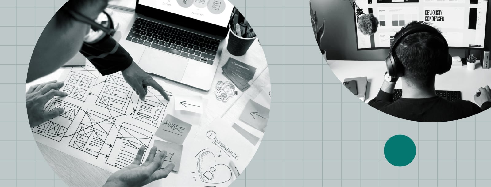
In the design space, a practitioner’s key role is problem solving. Architects, print designers, and the many creative disciplines sprinkled in between all share a need to tackle problems.
For interface designers specifically, that means crafting software to tame complex processes. With a fresh perspective, they’re able to sort through the clutter of complicated workflows and draw out new takes that are smart, simple, and easy to use.
This simplification process, though, has a sneaky way of influencing design decisions. Too minimal is possible, and it usually comes at the expense of your most active users. Form still needs to follow function: Are you slowing anyone down? Abstracting too much data away from them? Information density should be appropriate to the intended audience, which comes down to figuring out the who and when.
Enter the Power User
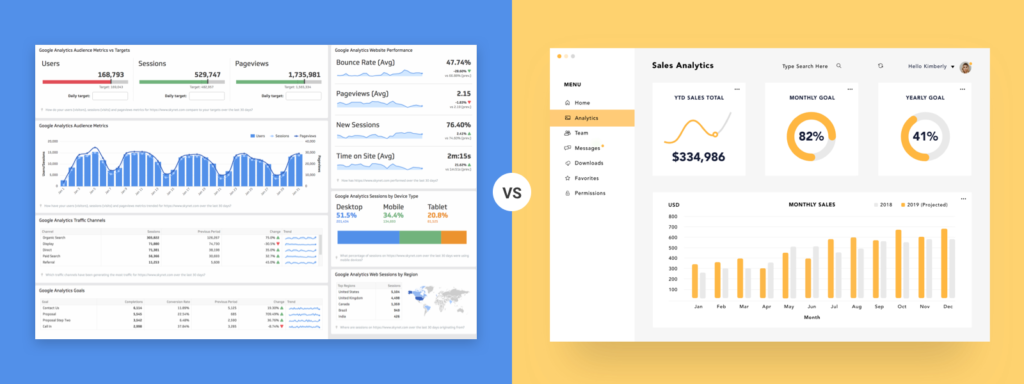
Power users are the day-in, day-out crowd. The ones that may just know an application better than the people building it. Think of a skilled pilot flipping switches in a cockpit, or a seasoned accountant flying through spreadsheets. They’re a driving force behind the success of process software, and repetition of use sets different needs than new or occasional users. It’s a group that needs special consideration.
Power users know just where to go and what to do in an interface to get things done. They aren’t intimidated by complexity, and often benefit when everything’s laid out at once. Extra content and extra personalization allow them to adapt interfaces for their unique (and heavily used) workflows. Keeping information density low is a hindrance.
The Goal: Cater to Both New and Power Users
In the face of complexity, newcomers to an application benefit from a bit of hand-holding. You’re looking for that perfect balance of efficiency: enough info to get stuff done, but not an overwhelming amount.
Even in the hands of the most capable user, an interface with poorly executed information density is a hill to run up. High density leans towards a high cognitive load, and an abundance of choice can mean indecision (analysis paralysis). On the flip side, low density can make every task feel cumbersome and overwrought. In both scenarios, productivity dips while the likelihood of abandonment conversely rises.
Finding the correct balance of information density to satisfy everyone can be tough, hinging on questions like:
- Is the app internal or customer-facing?
- What tasks are users hoping to accomplish?
- What information do they need to knock those tasks out?
- How much time will they spend with the interface? How often?
It’s a group of questions that requires becoming acquainted with your users. Defining their goals, motivations, and how to measure success all contribute to decisions around appropriate information density.
Striking an Information Density Balance
Tackling design thinking for new and frequent users alike, here’s a collection of key considerations to find that ideal approach.
Experience and Accessibility Baselines
No matter where the design lands, density doesn’t override the need for an accessible, user-friendly experience. The baselines of color, contrast, size, and spacing are all still beholden to standards like WCAG. Starting with commonly-used design patterns such as those spelled out in Apple’s Human Interface Guidelines or Google’s Material Design is a great first step towards a good foundation.
Type Design With a Focus on Legibility
Written words make up 95% of the information on the web, so it’s safe to say that type is pretty important. Poor legibility is a progress block at best and an accessibility failure at worst. Adhering to good typography practices for layout, hierarchy, contrast, and size ensures the information being presented is easily digestible by all users.
It’s (sadly) possible to disable user-friendly features like zooming and browser-level font size adjustments — please don’t. Some font families also cater specifically to display at small sizes, like the MicroPlus size of Mallory.

Poll Potential Users Early
You’ve probably heard this one already, but nothing really substitutes for a potential customer testing your design. As soon as a clickable prototype is ready, it’s worth putting in front of different types of users.
Experiential studies (focus groups, user testing sessions) are a turn off to many — they sound time-consuming and expensive. To at least get your feet wet, though, it doesn’t need to be a production. Poll friends, family, and coworkers (especially if it’s an internal application): What takes too many clicks? How does it compare with what you’re used to? Do you have everything needed to complete your task?
Food and/or gift cards are always great to exchange for some feedback — we usually went with tacos.
Flexible Presentation
If user preferences are all over the place, provide choice.
Power users, more than any other user type, benefit from the ability to tweak preferences. Fully configurable layouts, customizable font sizing, and smart filtering are all great ways to add flexibility to an interface.
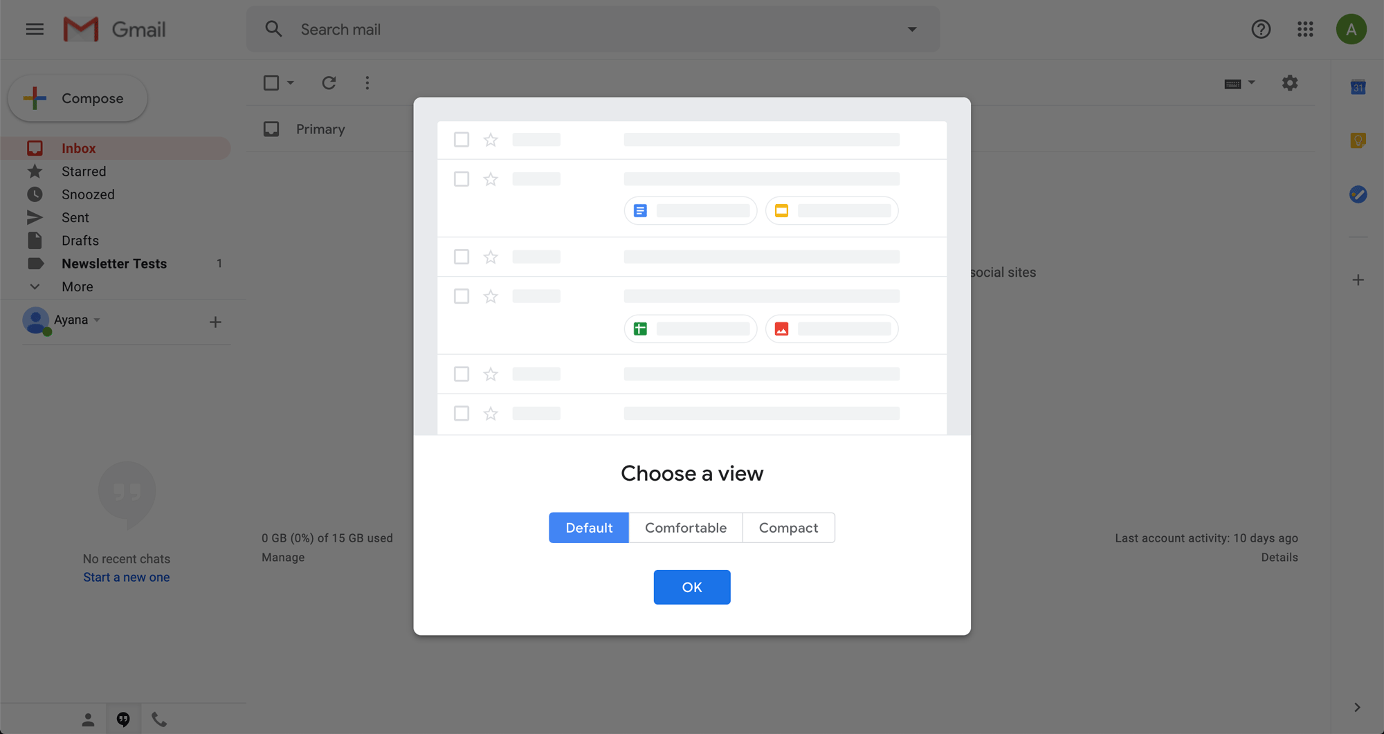
Gmail’s a great example. In addition to various filtering, sorting, and search features, they’ve included three options for adjusting display density within inboxes.
Data-Driven Feature Focus
The beauty of software is its ability to learn. Frequent users can benefit from applications that know what’s historically useful to them and adjust accordingly.
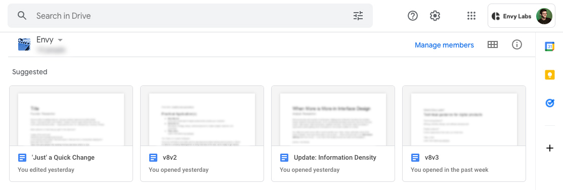
Keeping with the Google theme, Drive has a few solid features in this vein. Visiting a given drive (personal or shared) is topped with suggestions, ranging from:
- Things you’ve updated recently
- Things others have updated recently
- Documents that you often open at this time of day
It’s a small addition, but a big time saver for go-to files.
Turning Newcomers Into Power Users
Onboarding aims to slowly ramp up which bits of complexity a user can see, giving them the runway needed to level up. It’s popular in video games, where players have to demonstrate mastery of a skill to advance — typically to an area where that skill is necessary to succeed.
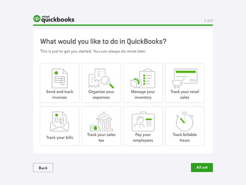
Quickbooks takes an episodic approach to the problem, guiding users through each feature separately. Customers are free to skip irrelevant sections (or the whole thing), but a hand is outstretched for anyone new to a daunting interface.
Information Density is Another Problem to Solve
Dense doesn’t mean crowded, unusable, or unfocused, and information overload isn’t always a measure of quantity. Design trends come and go, but for interface information density, sometimes more is more. Thoughtful consideration around users and their respective tasks should inform design thinking — what does the user need to see, and how much should we show at once?
What’s a Senior Developer, and Where Are They?

Great senior developers are in high demand. If you want that kind of experience on your dev team, a full-time hire isn’t your only option. Learn more.