Common Data Visualization Missteps on the Web

Article by Nick Walsh — Feb 28, 2023
Statistical visualization hit the scene in the 1700s, but we’re still working on translating it effectively to the web. Reasons abound:
- The underlying tech continues to iterate and change
- Visualization experts and software developers don’t typically overlap on a Venn diagram
- Device screens come in a number of sizes and contexts
- Interactivity adds a new layer of complexity
Evolving technology takes most of the credit for the last decade’s leap forward. SVG popped up as a cross-browser open standard (HTML canvas too, soon thereafter), allowing us to move beyond proprietary solutions like Flash and deprecated VML. Our modern visualization tools and libraries popped up in the renaissance that followed, giving web developers a reason to dredge up their forgotten trigonometry knowledge.
Demand can also claim a bit of that credit. We’re well into the era of big data, and insights hidden in lakes of information need to be surfaced. That’s doubly true when dealing with deliverables like executive summaries, public policy, reporting, and performance analytics.
With the right amount of demand — and the capability to deliver — visualization is all over the web. Like any maturing discipline, though, there are plenty of popular missteps. Here’s a collection of low-hanging growing pains.
Choosing the Right Chart
Picking the right chart is tricky, even for experienced practitioners. It’s a balance of details like data type, how much data we have, the space available, and the audience’s visualization literacy. Pie charts are a great example: they were everywhere, then considered harmful (but still used everywhere), then back in our good graces as a conditional option. If you’re not actively following the field, that’s a lot to track.
The Most Effective Visualization is a Number
Sometimes, the hardest choice is not picking a graph. Just because you can doesn’t mean you should. If the data can be distilled down to a number, there’s nothing clearer. If we wanted to talk about Orlando City Soccer Club’s (OCSC) win percentage for their first five years in MLS, a number hammers it home:

(Don’t worry, they’ve been much better since then.)
Sparklines, donut charts, and three-dimensional word clouds all look fancy, but effective visualization is all about conveying the point.
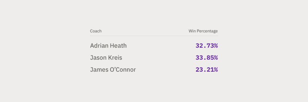
Tables Never Go Out of Style
Keeping with the number theme, it’s also worth mentioning our trusty friend: the table. They get a bad rap for being dull, but a well-formatted table is easier to skim than chart axes, relative volumes, and spatial arrangements.
If we’re interested in breaking down OCSC’s win percentage for their first three coaches, a table does the job:
Choose a Chart Based on the Data
Once we’re dealing with too many numbers, or comparing amounts difficult for humans to picture (one million versus one billion), it’s time to go chart shopping. Making the right graph choice is like following a flow chart — the data informs the decision.
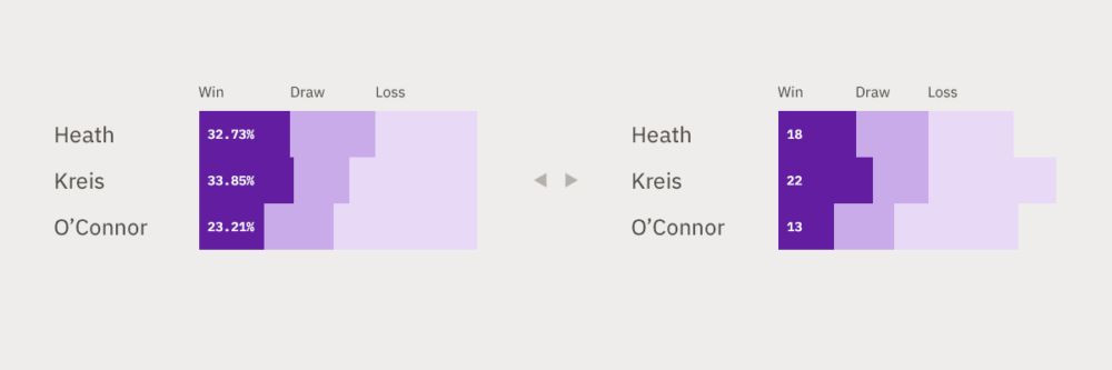
Let’s stick with the same example OCSC data. If we wanted to add draws and losses in there too, we’d turn to a horizontal stacked bar:

Good Data Visualization is Accessible
Out of the box, many graphs lack the care needed to reach your entire audience. Let’s cover a few common issues.
Visualizations are Images
As a visual medium (it’s right there in the name, after all), visualizations need some extra care to help screen readers out — just like photographs. Unlike photographs, though, adding a bit of alt text isn’t always enough. Describing our stacked bar example above fully would require a few paragraphs.
There’s no catch-all solution for every graph and output type. For SVGs, markup tweaks are usually sufficient after spending time acquainting yourself with current browser inconsistencies. HTML canvas elements, on the other hand, work just like an embedded image. If the visualization can’t be communicated with a sentence, providing a screen reader-accessible table of the same data goes a long way.
Picking Accessible Colors
Choosing the right colors — especially the right number of them — is another tripping point for many. Take D3, the web’s most popular visualization tool. Many examples out there use a built-in color scheme (Category10), which would turn our stacked bar into this:

Aside from disappointing designers everywhere, it’s also unreadable for certain types of color blindness:

When deciding on the right splash of color:
- Use as few colors as you can. Needing an excessive amount to communicate information is a complexity red flag.
- Make sure your choices meet WCAG contrast standards and are distinguishable for different types of color blindness.
- Using green for expenses and red for revenue may be confusing — pay close attention to the inherent positive or negative connotations certain colors carry.
Labeling Data
In a bid to reduce visual clutter, tooltips are an oft-employed tool for finer details. It’s not necessarily bad, but make sure they’re tested for keyboard accessibility, on touch devices, and with screen readers.
The Audience’s Chart Literacy
A visualization is useless if the audience doesn’t understand it (or have time to). Bar charts, scatterplots, line graphs, and pie charts are all super popular, and familiarity helps them hit the mark.
If the answer is something complex, you can build it in LEGO-like steps. Reveal the visualization in stages, focusing on one new feature at a time.
Good Data Visualization is Responsive
Like any other content on the page, visualizations should adapt to the size of their container. In the wild, there’s no telling which devices and contexts users will view our work through.
It’s difficult to find actual examples that do this well among the major visualization libraries. Like accessibility, there are two core hurdles: it takes extra time, and the right way varies on a case-by-case basis.
Options include:
- Letting the generated image scale like a photo
- Redrawing the graph (or parts of it) when the page resizes
- Enable zooming, remove detail, or change the chart type outright at varying sizes
Even the charts in this article aren’t safe — as images, they become difficult to follow as the browser width decreases.
Adding Interactivity to Visualizations
On the web, visualizations have a killer feature: interactivity.
Let’s trot our stacked bars out one final time. It’d be quick and useful to add a toggle between percentages and raw game counts:
There’s a catch with interactivity, though: Explorative visualization takes extra time to make, and there’s no guarantee that users will even use it. The New York Times found that only about 15% of their audience took advantage of interactive elements.
Like everything else we’ve talked about, it comes down to a couple considerations:
- Interactivity is great for engaged users, but don’t reveal your core insight through it
- Making multiple points takes multiple charts
We’ve seen success in splitting explanatory and exploratory charts into different portions of an application. In contrast to The State of Theology’s Data Explorer, for instance, the landing page presents notable findings in static visualization form.
Good Data Visualization is Performant
As a final word of web charting warning, beware the hidden magic of visualization libraries and frameworks. Understanding what they output (and how) is vital for troubleshooting performance issues, and deciding when to swap a library or change direction altogether.
Given a sufficiently large or complex set of data, we prototype early. For projects like Camassia’s Shipyard, these early stress tests led to format changes (SVG to canvas, in this instance).
The Growing Pains of Web-Based Visualizations
Web visualization: a pairing of two words that lean on context. The result is equally difficult to corral.
As charts and graphs make their way into web applications everywhere, hold them to the same base-level requirements as the rest of your content. Accessibility, responsiveness, performance, and clarity are just as important (if not more) here.
Up Next —
A Startup Founder’s Guide to That Vacant Tech Lead Role
Are you a non-technical startup founder hiring a technical lead? Use this guide to understand your options when recruiting and retaining top tech talent.
Read this Whitepaper →
