Adding Interactivity to Data Visualizations on the Web

Article by Nick Walsh — Mar 1, 2022

The web is a hands-on medium, and that benefit extends (as luck would have it) to the visualizations that live there. Charts in motion give extra context and clarity to a dataset.
Interactivity is a potent tool — when implemented carefully and correctly. At minimum, it adds:
- Time and cost
- Complexity
- Plenty of opportunities to make the end result worse
It’s like the gulf between building a game and taking a photograph. To that end, let’s grab a handful of examples and find ways to navigate around the (potential) shortcomings of interactive visualizations.
Key Ways to Pair Interactivity and Visualization
Where do we start? How do we break a visualization free from a static existence? Whatever you can dream up is probably possible, but an open-ended answer wouldn’t make this a very useful article. Pulling examples from my reference Observable notebook, let’s work through seven of the most common options.

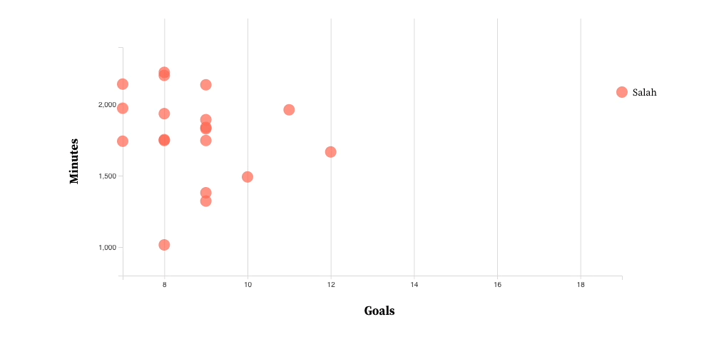
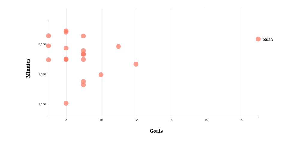
We’ll start with a scatter plot that maps the top 20 goal scorers in this season’s English Premier League (as of February 25, 2022). The x-axis denotes total goals, the y-axis shows minutes played, and the leading scorer earns a label on their plot (congrats, Mo Salah).
Changing a Dataset or Variable
The first (and most straightforward) interaction we can introduce is a simple data swap. Here’s what happens if we’d rather see the totals for a different league: Spain’s La Liga.

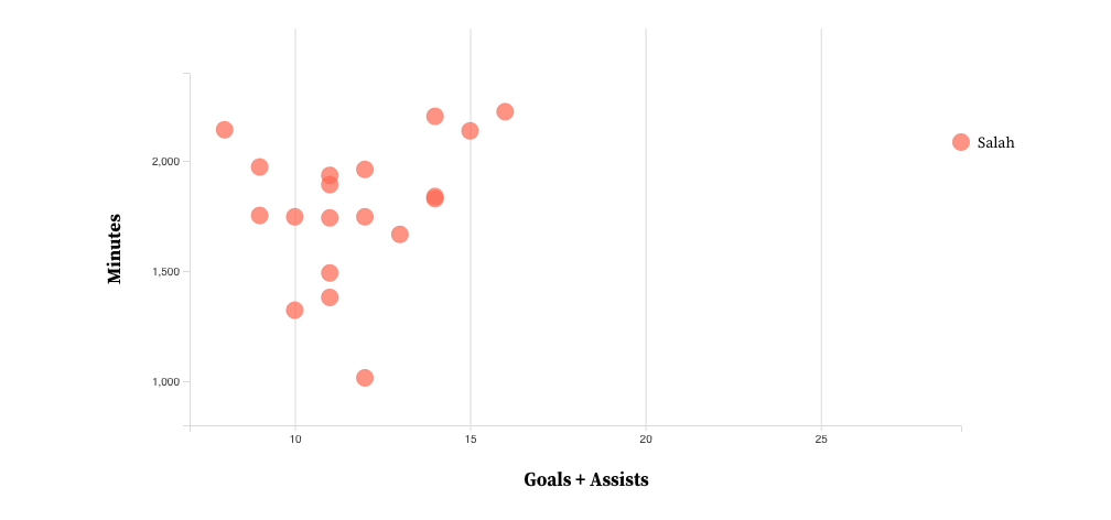
Alternatively, instead of switching the entire league, we can change a variable. Here’s the English Premier League with a combined total of goals and assists along the x-axis, where Mo Salah is still in the lead.

Filtering a Dataset
Beyond wholesale swaps, we can tweak displayed data with a series of filters. For our goal scoring example, that could mean adding controls such as:
- Thresholds for minutes played, like showing players with more than 1000 minutes logged.
- Time constraints, like limiting the counts to goals after January.
- Team selection, like members of the top 20 from Liverpool (shown below):
Toggling Extra Visualization Features
Adding supplemental data to a chart can range from useful to distracting, depending on the audience. If a feature is only helpful to some of your target user base, consider hiding it behind a toggle.
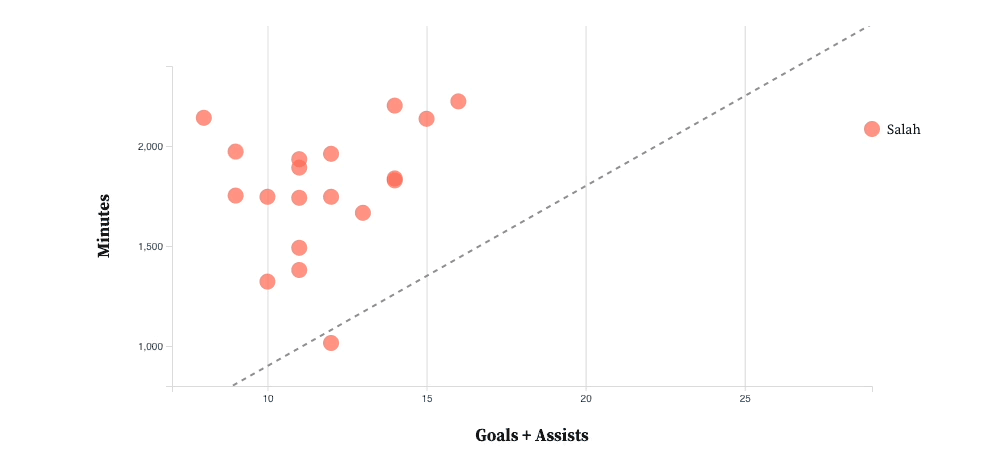
On our example chart, we’ll toss in a 1 per 90 reference line: Players under the line roughly average a goal or assist (1) per game played (90 or so minutes), which is an exceptional rate.
Combining or Separating Charts
Our next trick — combination and separation — hinges on how much data we’re trying to show. If the chart is too dense to pick out individual values, separation is a neat trick: We could provide a separate scatter plot for each team, arranged in a grid.
With the quantity of values in our example, combination offers up a quick way to compare datasets. Here’s what happens if we drop both leagues in:
Changing the Chosen Chart Type
Different visualizations highlight different features of a dataset, as we detailed in a white paper. Our scatter plot is great for showing groupings and outliers, but misses the mark on magnitude and volume. Interactivity can offer both perspectives:
With a bar chart, we miss out on minutes played, but gain a clearer picture of volume for leading players.
Adding Additional Information
The player with the highest x-axis value has been granted the gift of a label, but it stands to reason that users may want to figure out who the other dots represent. Informational panes, tooltips (which we’ll lean on below), and other means of selection can add some exploratory friendliness to a visualization.
![Adding tooltips when a user hovers over a plot for more player information]](https://wordpress.envylabs.com/wp-content/uploads/2022/03/interactive-6.gif)
Zooming and Changing the Level of Detail
Clustered data can be super useful from a macro level, but actionable insights also rely on the ability to zoom in. Seeing a globe is great, but not if you’re trying to get directions to a restaurant.
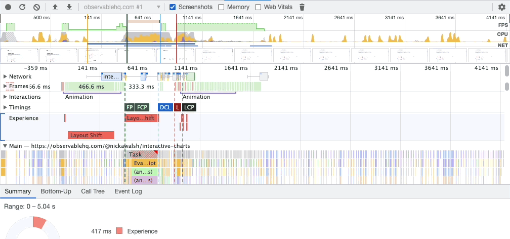
Switching gears a bit, here’s a performance audit in Chrome. These charts are invaluable for tuning a website — a lot of loading, processing, painting, rastering, and rendering goes into displaying this page, and the performance audit helps with diagnostics.
Across the top, we can see all of the browser’s actions for a recorded period. To see a specific segment in more detail, we can zoom in (here, the selection is called brushing) and consult the linked charts below as they change:
The Shortcomings of Interactive Visualizations
We kicked this article off with some ominous language around being careful and correct. Interactive possibilities in mind, let’s take a look at the key concerns behind all of this.
Assume Interactivity Will Go Unused
Interactivity should come with an assumption: Most users will skip it completely. Dominikus Baur’s article, often quoted in visualization circles (in addition to articles of our own), cites that The New York Times saw only 10–15% of users take advantage of interactive elements.
It’s a strike against the time and effort that goes into interactivity, but follow-up articles have continued to defend benefits like deeper data exploration and overall trust.
Don’t Hide Your Key Insights
Going one step further with unused interactivity: Make sure the chart’s default state tells your story. The scatter plot showing the Premier League doesn’t offer much help if we’re interested in Karim Benzema’s excellent numbers.

Don’t Rely on Hover
Touch devices, densely clustered data, and tiny plots make interacting with individual values awkward. Additional interactive means are typically necessary, like:
- Swapping to list view
- Zooming within a cluster
- Hoverable regions with a Voronoi mesh (as seen in this Nivo example)
Test for Performance
Exploration relies on convenience, and we’ve all abandoned sites that took too long to sort themselves out. Ensure that all of the data swapping, filtering, and feature adding we’ve been covering so far is as snappy as possible.
Tips for Interactive Elements
So, we have interactive visualizations (added carefully and correctly), but what’s next? Here are a few areas to explore and tips to keep in mind.
Split Exploratory and Explanatory with Design
Charts tend to fall into two camps: exploratory (the examples in this article so far) and explanatory (something like a static executive summary). Beyond one-has-buttons-and-the-other-doesn’t, design cues can help highlight the difference, too. Color palette swaps, different framing or sizing, entry animations, and a host of other tweaks point out graphs with interactive flair.
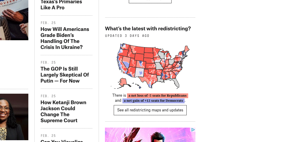
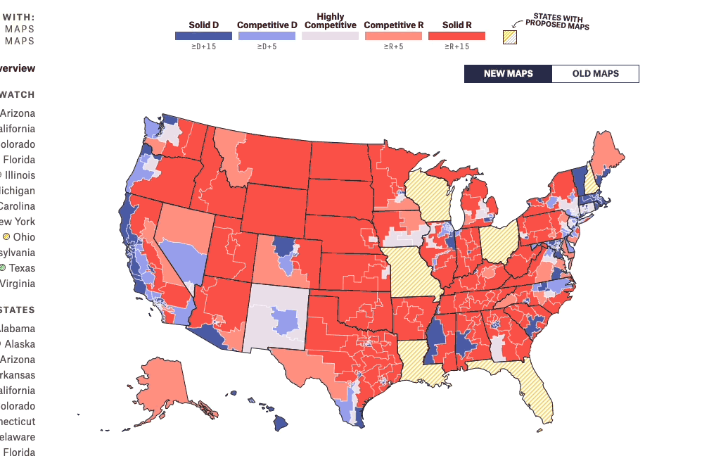
On the explanatory side, highlighted data is king. As an example, here’s a map detailing the latest in US redistricting on FiveThirtyEight:
It provides a quick glance at the data, but also serves as a link to their exploratory version. Now, we’re able to toggle maps and drill down on state data:
Pay Close Attention to Axes
Adding motion requires paying extra attention to the chart’s axes. Fitting our reference marks to the current data means we’re pulling the rug out on users when the data changes. Note that when we swapped leagues in previous examples, the x-axis stayed consistent — making it far easier to compare results:

Animation is Also Information
Animation is a specialized visual language of its own, and its effect on visualization is a field of study unto itself. As a starting point, it helps to track two questions:
- Does the animation cause confusion? If motion makes data hard to read, that’s a pretty good sign it shouldn’t be there.
- Does the animation make sense? When the league data switches, our 20 plots could slide to new locations. Those values, though, represent two different players — a more distinct transition is appropriate for what we’re working with.
Add Complexity in Steps
Simplicity is great, but some charts are complex because they need to be. When the right chart is intricate, it helps to introduce features in steps (and with explanations), like this classic Tampa Bay Times report.
Interactivity is a Complex, Medium-Defining Capability
Interactivity is the defining feature of charts on the web, elevating them from images to hubs of exploration. Like most things in a browser, there are drawbacks, trade-offs, and special considerations — equipped with the seven primary means of adding interactivity, though, we’re able to tackle most feature needs.
If you haven’t already taken a peek, visit my D3-powered live notebook with the examples used throughout this article.
Up Next —
How Not-Invented-Here Syndrome Affects Technical Direction
Risk can’t be avoided in product development, but how much risk tolerance for outside software do you have, and which ones are worth trying? Learn now.
Read this Article →
