Starting a Design System (Without Overthinking It)

Article by Nick Walsh — Jul 31, 2024
Design systems. They’re a well-tread commodity at this point, headlining conferences, products, podcasts, and articles. We’re guilty, too (1, 2, 3) — and here’s another post.
What’s left to talk about? Day one. A fully-formed design system is an organization-spanning, governed, drop-in, ready-to-use monster of a project, but it takes time to get there. And, the sooner the pressure to live up to the “industry ideal” is applied, the harder it becomes to reach.
Let’s take a look at the early stages of a design system: what’s important, what others experience, and the usual pitfalls on the way to that “fully-formed” ideal.
Simplifying the Design System Goal
To start, we’ll lower the bar (a few times). All of those conference talks and articles set high expectations — and a confusing standard, as this classic (in web years) article collates. Design systems have an elusive definition:
- A style guide? Yeah, that seems like table stakes.
- A component library? Sure, standardized code is nice.
- A set of content guidelines? Keeping the same “voice” would be handy.
- An icon library? We need those, and they should be consistent.
- An approach to animation? Yep, motion could use documentation.
And on and on. Like a weird mix of scope creep and gatekeeping, it’s hard to argue against a design system slowly absorbing and managing everything.
What are we getting at? Building all of that right away is time-consuming, inconsistently useful, and nigh impossible. It’s better to have a small batch of high-use, iteration-ready features than overstretch to meet someone else’s idea of a “real” design system.
In other words, if your first version is just a style guide, that’s okay. It’s a great place to begin.
(Real) Design Systems in the Wild
It’s easy to take a look at leading examples — Shopify Polaris, Vercel Geist, Atlassian Design System, etc. — and think:
- That’s a tall mountain to climb
- Clearly, everyone else is good at climbing tall mountains
In practice, it’s not so rosy. Data from communities like Ben Callahan’s The Question surfaces real challenges with adoption, implementation, and impact. Just like everyone in your Instagram feed isn’t on perpetual vacation, every design system isn’t on par with Uber Base.
Following a conference talk, Elyse Holladay put it best: The number one thing people said to me after? “I thought it was just my dysfunctional team.”
(One more fun thing: Notice how different all of these examples are. There’s overlap, sure, but it would be impossible to hold one up and say “this is the perfect template for all design systems everywhere.”)
Starting Where it Matters
So, these things are tough to pull off, but they don’t have to be everything to everyone immediately. Where do you start? Two things to remember:
- A design system is whatever you need it to be
- And what you need it to be is useful
This article harps on usefulness a lot, and for good reason. If it’s useful, it’s justifiable, and that gives you the kind of time needed to iterate towards “fully-formed.”
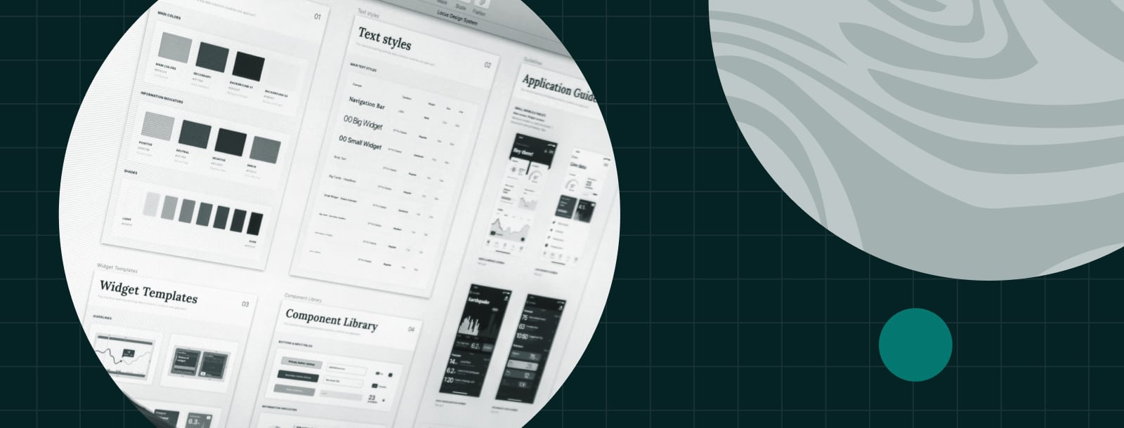
Nine times out of ten, usefulness begins with a style guide — or, simply put, some documentation on how things should look. Of all the possible features to document, applications get the most mileage out of describing colors, typography, and some basic UI elements.
Inward Versus Outward
As your design system grows, new pieces have to come from somewhere. You’ll hear about two main sources: inward and outward.
- Inward means you build a feature in context first (like adding a button to a product), then loop it back into the system.
- Outward means you define the feature first, then use it.
Which is better? Neither, really — the actual process tends to sit somewhere in the middle. A designer can guess at most of the needs of a button looking outward, but developers will inevitably find more requirements as they go. Developers are good at building reusable pieces in context, but they may not meet the needs of every product organization-wide. Trying to mandate either-or misses the mark.
Early Tips
Here are a few guidelines we keep in mind at the start:
- Favor reversible decisions. You won’t get features right the first time.
- Some styles, ideas, and chunks of code won’t be ready to make “official.” It’s okay to document wait-and-see elements until they’ve had time to cook.
- For organizations of all sizes, style mandates — especially if there weren’t any before — are a hard shift for teams that had a lot of freedom. The design system group should be a helpful resource during and after the transition.
- A style guide’s weakness is in verification. Teams can be directed to follow it, but you’re not passively guaranteed that the implementation will match. Buttons may lack the right spacing, type may not be the right size, color may be used incorrectly, etc. There may be a gap, but that gap will be easier to close later with a style guide as a starting point.
The Usual Issues
Now it’s time to actually build the thing. Here are the usual issues we run into, even (especially) at the biggest companies out there.
A Lack of Governance
Design systems are opinionated and stick around for a while. Who has the final say? When there’s a lack of leadership, three issues pop up:
- Decisions lack context, favor the short-term, and fail the “easy to reverse” test.
- Updates lean more towards the inward process (build first, then add). Since that transfer is “extra” work for someone, there’s a chance it never happens without oversight.
- If the system spans multiple products, one’s needs will have an outsized influence — and that application may not best represent the organization’s goals.
Permission to Skip
Can someone skip using the design system altogether? Who makes that call?
We’re back in the realm of usefulness, and leadership has to be aligned. If they’re able to grant exceptions — whether that’s because they find the system problematic, they aren’t bought in, or they just don’t care — building a system at all is questionable. There are legitimate special cases (i.e. tests, prototypes, truly temporary things), but they should be few and far between.
“Temporary” Workarounds
Temporary has a habit of becoming synonymous with permanent when it comes to code. We mentioned that some styles, ideas, and bits of code won’t be “finalized” in the design system right away, and that’s okay. Those one-offs need documentation, though, lest they cement themselves in a corner of a single application (and become a piece of lore that only one developer knows how to deal with).
It happens all the time: special buttons, unique text styles, extra-stylish cards, new modals, and the like.
Too Much Flexibility
For the second time in this section, design systems are opinionated. There’s a fine line to walk between making everyone happy and making everything consistent and manageable.
How many button variants are too many? It’s worth figuring out if a product really needs a fifth type, or if the system could be applied differently. Once it’s added, you’re stuck supporting it for a while.
On the far end of the flexibility spectrum, we’ve worked with design systems that allow custom styles on all of their components. It’s freeing for teams (they can do whatever they want, ultimately), but wounds the intent. Predictability, management, and the notion that future updates won’t negatively impact current usage are all ceded to individual applications. Centralization is lost.
A Narrow Model
In most cases, a new design system is built alongside a new look for one (or more) of an organization’s properties. Are those properties representative of everything the system will cover, though?
Commonly, we see style guides and components that are built around marketing pages. Once it’s time to apply it to a piece of complex software, though, there’s a wall:
- Some decisions (like text styles) won’t be suited to a dense, workflow-driven app
- Stuff that the marketing site doesn’t use — tabs, modals, toolbars, notifications, and a number of interactive elements — will either be missing or untested in context.
Environment Assumptions
It’s tough to build a design system that’s truly agnostic to the technology stack it’s used alongside, and, in most cases, that extreme level of portability isn’t worth the effort. After talking through the danger of exceptions, though, the quickest way to guarantee them is tying the system to an environment.
Does the component work in a single-page application? Without a server? Outside of React? Should it? Part of the governance and role of your organization’s tech leadership is determining how broadly applicable to make all of this.
A Painful Update Process
Iteration-ready is a core feature of design systems, especially when we’re talking about not doing everything immediately. The obligation here includes:
- (Up-to-date) documentation
- Deprecation notices
- Formal versioning
- Assistance with major updates
It’s all tied to buy-in and management. Teams that don’t start here have a harder time implementing it later, and usually have lost a bit of goodwill in the process.
Mistaking the End for the Beginning
A design system will be a big, impactful thing, but it doesn’t have to start that way. Early on, the name of the game is useful.
In software (and in most businesses, really), folks are used to working inside of an established system. Starting from scratch is tough — especially when we try to do it all at once. Focus on simple wins, impact, and build from there.
Up Next —
Helping Users Hate UI Updates a Little Less
Software UI updates are an unavoidable constant. The key for designers? Get ahead of any change aversion and avoid common design backlash. Learn how.
Read this Article →
