The Right Way to Implement Component-Based Design Systems

Article by Ben Stankich — Mar 10, 2021

Implementing a design system for your web application starts long before developers open a code editor. The end result is directly related to the quality of collaboration between designers and developers during creation, build-out, and testing. Great design systems aren’t just passed from one team to another, they’re carefully crafted together.
These design systems give teams greater consistency, maintainability, and efficiency for building software. This also rings true for component-based architectures, which allow code to be written in self-contained blocks that connect to form an application.
Though distinct entities, these two pieces are interconnected: two parts in a larger process. We’ll look at how to cross the gap from design system to software components.
This process guide focuses on building component systems destined for a single application, but the principles remain for multi-app usage. The latter case may entail multiple frameworks, require housing the component system as a standalone, and impose additional naming constraints — but that’s a different guide for another day.
For now, let’s first dive into why this whole design-system-powered application setup is the right approach, then we’ll focus on the process itself.
The Benefits of Building Software Applications with Components
Win at Consistency
The larger the application — or the team behind it — the more necessary it becomes to create intentional structures and processes that maintain consistency. Unnecessary duplications, difficulty in tracking variations, and out-of-date style or functionality will all crop up naturally. There needs to be a plan to fight against these.
A single cross-discipline system that describes components helps project teams alleviate these issues and stay on the same page. Everyone can reference the same style, function, and naming of the application’s building blocks. Any changes to the system trickle down across design and development.
Sane Management of Design and Code
Component systems also provide a solution for managing changes. If an application is composed only of components, the mountainous job of maintaining the entire app becomes a matter of maintaining its individual pieces.
With a single source for each component instance, small edits or sweeping changes to all instances can be made from a single file rather than multiple ones. Work is done in one place and easily shared throughout the app. Since a single component can be flexible enough for different use cases, you can do away with most instances of duplicate or out-of-date code.
Watch Efficiency Skyrocket
Well-made design systems aren’t just great for designers, they increase efficiency during implementation. Each component and its variations are considered before building begins, and once built, developers get to reuse them instead of reimplementing them.
This efficiency also applies to scaling the app. When there is a well-defined component system in place, the path to building on top of existing work is clear: extend existing components or assemble new ones.
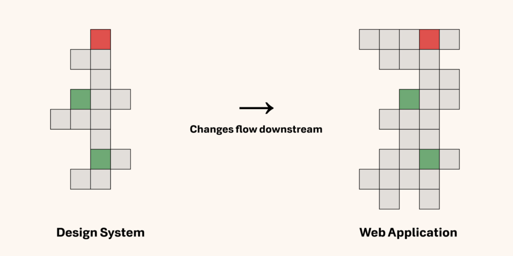
Design systems provide a layer of abstraction to the work of building web applications. Since the application is an implementation of a broader design system, you can evaluate and build upon the system, then carry changes downstream into the application. There shouldn’t be a need to first inventory the application or pore through dense business logic to get a good grasp on where to begin.
Design Systems Are Better When All Disciplines Have a Voice in Their Creation
The advantages of a componentized application are clear. The next question: How do you ensure the design system behind it is set up for success during implementation? No matter what final form the design system takes, the process needs to include each discipline that will apply it.
While designers are likely to lead the design system process, it’s important to get developers involved early on. “But you haven’t seen the poor design sensibilities of the developers on my team”, you may object. Whether that’s true or not, developers aren’t being brought in for their visual design sensibilities, but for their system design experience.
Developers are already accustomed to component-like structures (design systems borrow from programming concepts after all) and can bring a lot of insight into the process. They can also share which solutions are technically possible and estimate the effort (and thus time and budget) required to implement them.
Without bringing developers into these early stages, those layers of context around implementation may be unavailable to designers. The earlier you have this information, the sooner you can plan around potential obstacles. Design decisions tend to have a snowball effect (each decision affects the next in some way), so creating viable designs up front bypasses a trip back to the drawing board should an initial idea not work.
Aside from the primary dialogue around component details, it is helpful for designers and developers to discuss:
- Which proposed design solutions are most feasible given project constraints?
- Which design concepts require mockups? Sometimes documentation will suffice for details that are ancillary or are better implemented in code.
- What content should be provided in the design system? There will always be the basics, but consider aspects like responsiveness, animations, and state transitions, or easy-to-forget elements like empty and loading states.
Paving the Way for a Successful Design System Implementation
Once the design system is formed, it’s tempting to start building its corresponding components right away. Unless you have unlimited time and budget, jumping code-first is usually a mistake. Following a few steps at the onset can significantly upgrade the implementation process.
Step 1: Estimate Individual Builds
Before the first build, it’s necessary to determine the importance and complexity of components as they relate to the overall project. Gathering this context at the onset will prevent unnecessary rewrites later. Simple per-component estimates work alongside priorities (see the next step) to provide an overview of what’s on your plate.
To form these estimates, developers will need to familiarize themselves with the design system. It’s time to read through the final designs, ask questions, and initiate any necessary conversations. The design system isn’t just for reference; it’s a foundational, evolving document that should be given its due attention from the start.
Here’s a tip: Don’t base estimates solely on visuals, but consider a component’s hidden complexity. Ask questions like: Where will this component be used? What possible states might it be in? What functionality is tied to it? What other components does this depend on?
Step 2: Prioritize Components
The next step in a good implementation checklist is setting priorities. One best practice is to build the most basic components — such as buttons, colors, headings, icons — before moving to more involved components. Tackling other global elements like navigation and page layouts early can also be a good idea, laying the ground work before filling it in.
For the rest of the components, prioritize based on importance and urgency. This productivity strategy, known as the Eisenhower Box principle, can be applied from the feature level all the way down to the pieces that form them.
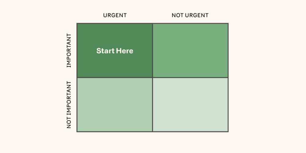
Which components are most important? Which components are most urgent (required early in the development timeline)? Ones that check both criteria are likely the best next step. Along with your estimates, these factors will help you plan out the development timeline.
Development roles are rarely clear-cut these days. Even within front- and back-end developer roles, there is a lot of specialization. These initial planning stages are a great time to consider the relationship between project developers and coordinate areas where they intersect. When do hand-offs occur? Who starts first? What responsibilities are divvied out and which are shared across the board?
Step 3: Utilize a Component-Driven Development Environment
Once the design system is in place and you’ve finished the previous steps, you now know what you’re building and how you plan to go about it. It’s now time to ask: Where will the development take place? There are a lot of possibilities, but the advent of component-driven development environments has provided an excellent answer to this question.
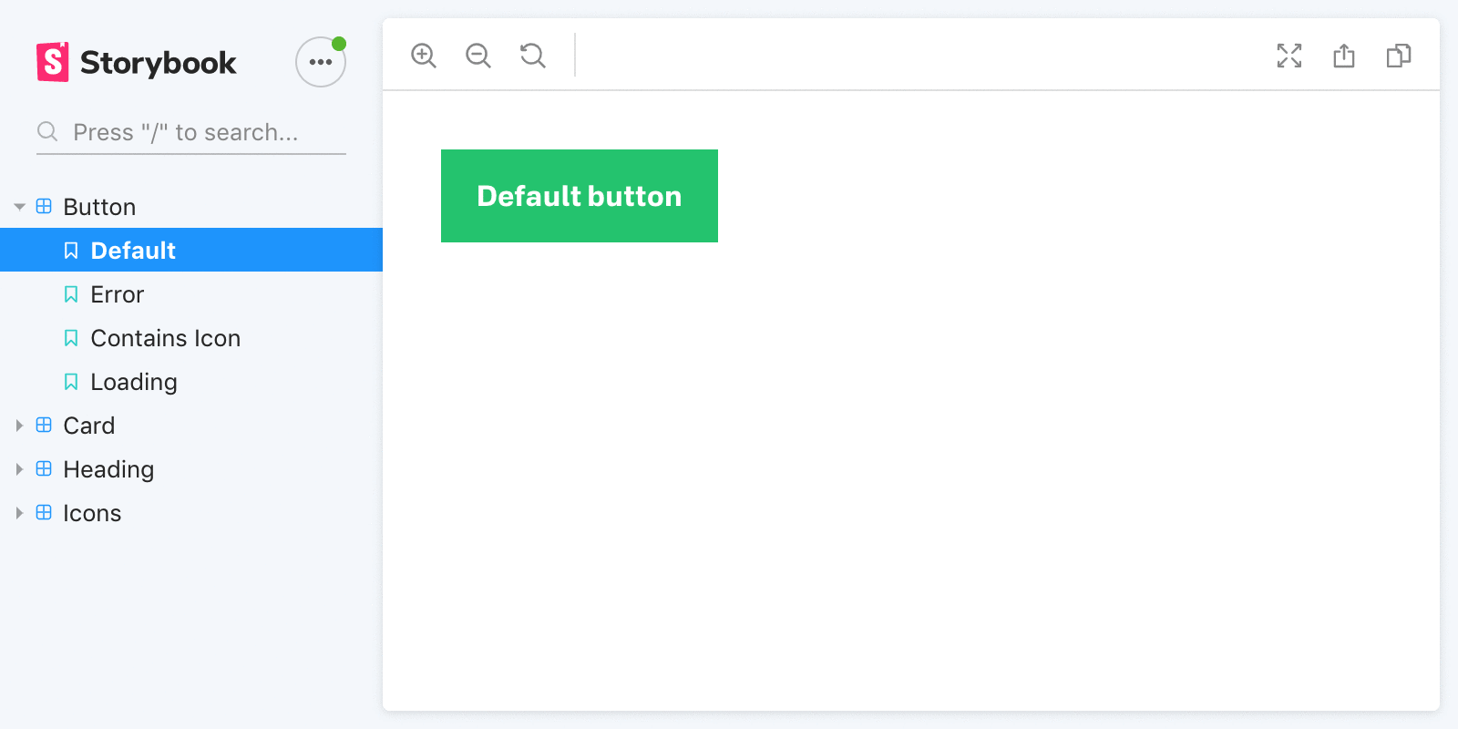
Let’s look at the leading player in this arena. Storybook describes itself as an open source tool for developing UI components in isolation. It lets you preview components as you build them, see every component you’ve built for the project, and view the possible states of these components. In short, a tool like Storybook is your best friend in staying organized during (and even after) implementation.
Storybook is widely supported — nearly a dozen JavaScript libraries and plain HTML — and is straightforward to use. If you’re worried about it being obtrusive, know that using Storybook completely follows the normal build out process:
- Build components
- Import them into Storybook
- Create instances of those components and add labels. We call these “stories”, hence the name.
Planning your timeline and setting up a component-oriented tool might feel like extra setup, but they really work towards making the implementation phase an efficient success. The more these steps become a part of your process, the less they’ll feel like overhead. And the more they’ll feel like this is the right way to do things.
Building Design System Components with Storybook
Now it’s time to make good on the article title and zero in on implementation, with a focus on using Storybook. When you create a new component, begin by building its default state. Find the most essential aspects of the component and write a generalized, default version of it. (Each component should be usable in this state).
For example, a given Button component will require at minimum:
- a label (such as text, or an icon)
- some form of color, size, visual pizzaz
- an action to perform when triggered
The default configuration of these characteristics will inform the base usage.
Next, modify the component to include other states. For Button, this may include handling errors, allowing for an icon to display alongside text, and building a loading state. In most cases, these states should work independently of each other to maintain a separation of concerns.
Document Component States and Use Cases
Many developers utilize Storybook to preview components as they build them, and document along the way. Inside the Storybook GUI, each component has its own “stories” to showcase its possible states and provide example use cases. For instance, the Button example might have the following stories:
- Button in default state
- Button in error state
- Button with icon
- Button in loading state
Here’s what the Storybook markup might look like for Button‘s stories (built in React and passing props to Button to set its internal state):
Pretty simple, right? Besides stories for each component state, it’s sometimes useful to have a story showing the component in common contexts. For example, if you commonly nest buttons inside a card component, you may want to show this pattern as a story of its own.
One note on component naming: Be sure to discuss this as you build out the design system. For clarity across the team, use the same names in the design that will be used in code as much as possible. Remember that for some teams, naming is not only meant to give meaning, but to denote structure (e.g. NavigationMenu is dependent upon and is composed inside its parent Navigation).
Testing and Iterating Components
Gathering feedback during testing isn’t just for evaluating a final product. Just as visual design benefits from developer involvement, testing coverage expands and improves with designer input.
Once you’ve made headway in building out the design system, give designers access to test components and provide feedback. Design tools are becoming more dynamic, but interacting with components in the browser will always beat out static designs. Necessary adjustments often arise during testing, and these tweaks are ripe for pairing opportunities with developers.
The feedback process should begin with the most basic components, since they are used throughout. Fundamental changes to these components late in the game can require analyzing and editing many instances to avoid breaking past work. As such, it’s best to bring them close to final form before they start to appear everywhere.
If you’ve set up component stories within Storybook, you already have a great tool for designers to complete visual reviews. For those who don’t have local access to the project code, it’s possible to deploy Storybook.
This is a good time to mention some of the ways you can level up Storybook with its addon library. Controls adds a GUI for designers to interact with the component’s API without writing code. These no-code adjustments allow anyone to put the component through its paces and catch those edge case issues.
There’s an add-on for most needs — embed your Figma designs next to their corresponding component stories, see accessibility issues and tips, view pseudo-states, toggle responsive breakpoints — all within stories.
Another pairing opportunity at this stage is to collaborate on scenarios not accounted for in the design system when they arise. These tend to be smaller in scope and complexity, and designers and developers can work together to find a solution that makes sense at this stage in the project. Developers may already have suggestions at this point in implementation.
Design systems are living documents, so be open to extending or revising them during testing. Implementation brings new insights. On-the-fly changes might feel haphazard, but when thought through by the team, they can bring easy boosts to the system.
The Real-World Advantages of Design Systems
How does all this planning, setup, and conversation play out in the real world? For us, developing a robust design system for the Moonllight fantasy soccer web app yielded big benefits during implementation.
Not only did it help the dev team create a consistent and maintainable application, the testing and hand-off points were a success: We saw collaboration improvements and faster-to-production changes. Simply put, both the application and process behind it were better.
One such example was a change to our card layout design. With an information-dense UI, the layout needed to be easy to read and interact with. In testing, we had unnecessary whitespace that made certain screens less usable on mobile devices. The change was straight-forward: remove padding around certain card layouts, making them full-width on narrow screens.
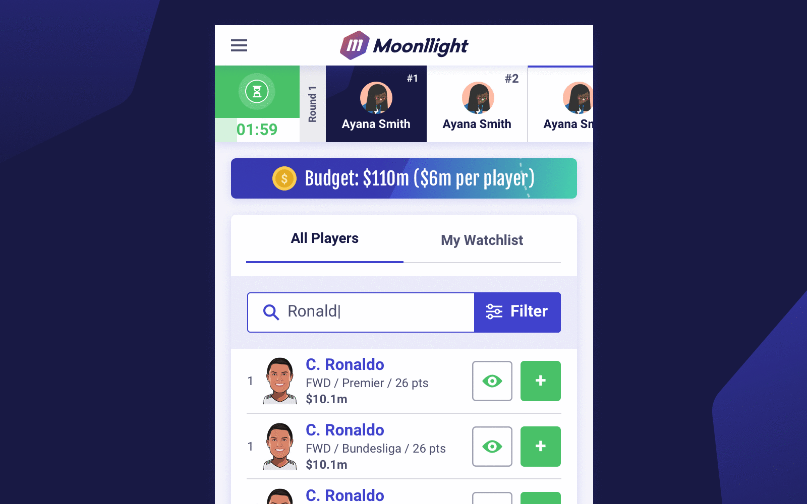
Thanks to a well-maintained testing setup, our design team was able to quickly interact with their designs on different types of devices, find areas for improvement, and document global changes with ease. We didn’t have to wade through mockups or update a bunch of layers in design files. Instead, we made the component code tweaks and documented changes in our design system hub.
Everyone was on the same page and the design direction was never out-of-date. Intentional collaboration during testing and an integrated design system reduced friction to make changes like this one as easy as it should be.
Better Implementation Through Process, Tools, and Good ’Ol Communication
Don’t leave cross-discipline testing, feedback, and discussions until after implementation. Having these interactions early on will elevate the design system, ensure the vision is carried through development, and make iteration easier if better ideas surface.
Creating applications with a solid design system is a clear winning strategy. Be sure to do it the right way by establishing opportunities for communication and collaboration across the team at each stage of the process. There are an abundance of great tools for this, so be sure to find ones that work well for your team and help you elevate your process to its highest potential.
Up Next —
Why Being a Software Generalist Ensures Future Successes
To solver future problems, developers need to be software generalists. Discover 4 ways developers can improve their skills and stay effective.
Read this Article →
