Helping Users Hate UI Updates a Little Less

Article by Ayana Campbell Smith — Jul 18, 2024

Seasons come and go. People evolve and grow. One day you’re a young and vibrant 20-something and then wham, Gen Z tells you skinny jeans aren’t cool anymore. Ouch.
When it comes to software design, change is also an unavoidable constant. Whether it’s updating an outdated style, pivoting to align with new business goals, or introducing features to remain relevant, the reasons for interface changes run the gamut.
Change is inevitable, but humans are innately opposed to change. Thanks, psychology. When faced with these competing forces — the need for evolution and the opposition to it — how does one find a happy medium?
Success with change management is shaped at three levels: planning, execution, and delivery. The goal isn’t just to create a stellar product (that’s a given), but also to keep users engaged with updates that excite and entice without a bunch of warranted backlash. To start, let’s talk psychology.
The Psychology Behind Design Changes
There are two principles in play:
- Change aversion is the initial negative reaction from a new or unfamiliar experience. While the impact of the change is usually short-lived, it leaves an impression that can be hard to get over. Just think of your favorite musical artist’s “experimental” work. The first listen is probably confusion at best (and dismay at worst), but subsequent plays may reveal a different truth. This is change aversion at work.
- The mere-exposure effect asserts that certain things are perceived as better (whether true or not) simply by virtue of being familiar. Repeated exposure only reinforces this preference: Comfort and safety are best found in what we know well. Going back to music, this also explains why older tracks seem to strike a stronger chord. The new stuff may be good, but nothing hits quite like your high school playlist, right? Is the music actually better? Hard to say, but familiarity sure has a way of making it feel so.
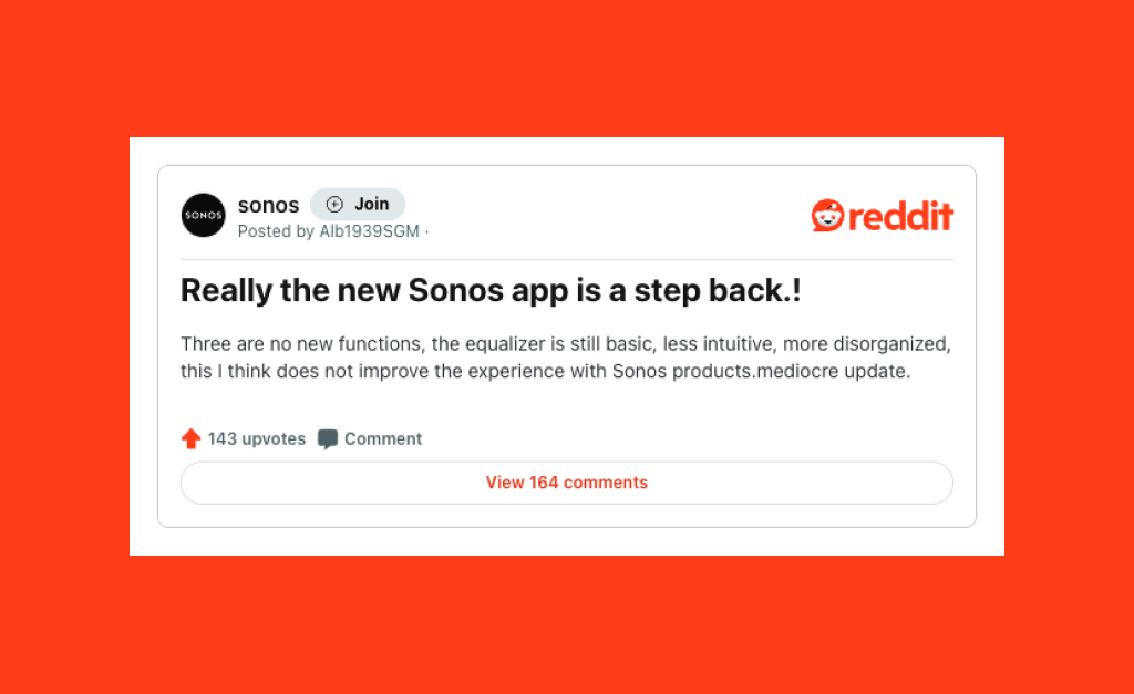
Examples of design updates struggling with the public are plenty, but for different reasons. Take Sonos’ 2024 refresh, which caused quite a (warranted) stir. Upon release, customers quickly noticed the removal of many core features and serious accessibility issues, leaving the previously highly-praised app a shell of its former self. In response, Sonos had to acknowledge and address the release’s shortcomings.
On the other hand, the initial shock of an update usually wears off. In 2016, Instagram took a bold leap by abandoning skeuomorphism and embracing the flat design trend. Initially, the new direction received negative reactions from users who missed the nostalgic Polaroid camera-inspired app icon and felt the updated interface lacked personality. Despite this negativity, Instagram stood fast, and explained the reasoning behind the change in an article on Medium. The bold app icon and a pared-back user interface styling put the focus on what made the platform shine: users and their content. In the years since, Instagram’s look has stood the test of time as the app has evolved into much more than just a photo-sharing platform.
Are updates a losing game? Not necessarily. As with any change to an existing product, pleasing everyone is an impossible task, but steps can be taken to leave naysayers in the minority.
Download: Is a Refresh or Redesign Right for You?
Download our self-assessment Q&A to help determine if it's time for a site refresh or redesign.
Plan, Execute, Deliver
Now that we can pin some of this on psychology, let’s discuss ways to counteract it.
Categories of Change
Updates typically fall into one of three categories, each carrying differing levels of impact on the end user:
- Visual (UI): These changes are purely aesthetic. Maybe your current designs have fallen out of trend, or a company-wide brand refresh mandates new colors and typography. While this type of update shouldn’t have a major impact on how users flow through your application, it’s the most attention-grabbing. Some will like it, others won’t; it’s all a part of the game. Just remember that design is no longer “objective” when there are readability or accessibility problems.
- Functional (UX): Done well, these updates improve how users interact with your product, whether it’s a new feature or a reworked experience. An important note here: Feature additions are much easier to sell than changes to existing stuff. The former can be adopted at the user’s leisure; the latter has the potential to derail workflows and productivity completely if the execution is poor. If functional changes can’t be avoided, the plan, execute, and deliver steps described here are more important than ever.
- Structural (Backend): When it comes to UI and UX updates, designers also have to keep track of implementation challenges. Despite remaining unseen by users, behind-the-scenes changes can carry a big impact. A new dashboard chart may rely on information that takes a long time to load; a slick new sign up flow may stress the servers out; a new table may be too complex for developers to cover all of the edge cases. The final outcome is on designers, too, and a “better” design isn’t better if it’s worse in context.
Plan
Before any work begins, it’s time to prep. Data-driven and user-informed each pair with the change process to reduce the likelihood of a bad reception. Important questions to answer at this stage include:
- What are your users’ pain points?
- What things do your users actually like?
- What sets you apart from competitors? How can that be built upon?
- Which features are used most often, and will proposed changes have an impact?
- Is this a user-driven issue, or a business-driven issue?
It’s part domain expertise (what does your product do?), part design expertise, and part customer feedback. For the latter, survey work is a giant field of study unto itself. For now, just know that some gift cards or catered food could go a long way towards collecting thoughts directly from your users — and keep the answers to these questions from being guesswork.
To wrap this phase up, set a course of action for how it all gets done. Use this time to iron out priorities, clearly define how work will be distributed, and identify who owns final approval. The more you nail down, the easier things become — time will be spent doing instead of figuring out what to do.
Execute
Now it’s time for all the thinking and planning to give way to doing. There are plenty of articles out there about “designing good,” so this is less about quality and more about preparing users.
You won’t get it right the first time, and that’s okay. Otherwise, we wouldn’t be in the middle of an article about updates and iterations. Sometimes, you have to walk down the wrong path a few times to find the right one.
This stage is a good time to start giving customers a peek at what’s in the works. Drumming up excitement pre-release will help gauge reception, tackle any user concerns, and provide reassurance about what’s to come. Involving users along the way builds trust and demonstrates your organization’s commitment to creating user-focused products (as with the rise of Community Managers in gaming). A word of warning, though: Pretending to listen is worse than skipping community outreach altogether.
Give Ample Notice
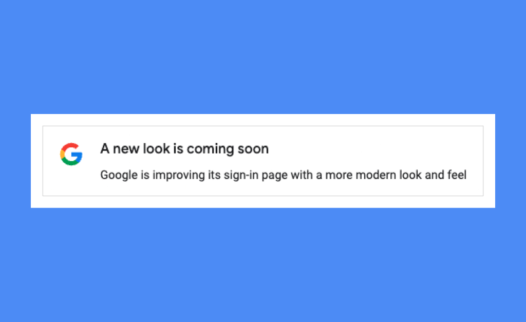
Updates should never come as a complete surprise. During the lead-up to launch, there are a number of ways to give notice about what’s coming, including:
- Internal Messaging: Think things like in-app notifications and sticky banners. These are useful since they meet your users where they already are.
- External Outreach: Email blasts, social media posts, and blog articles create additional touchpoints — and, if desired, a place for two-way communication.
When crafting your message, be sure to hit on a few key points, like:
- What’s coming and when the changes will take effect
- The reason for the changes and their (honest) benefit to users
- Complete transparency about any features or functionality that will be removed
Run a Beta
Beta testing introduces updates to a small subset of users to gauge reactions, pinpoint bugs, identify missed edge cases, and gather feedback. A dress rehearsal, before a much larger audience dives in. It also comes with an air of exclusivity — loyal users and evangelists can be rewarded in the form of early access.
To get the most out of beta releases, there are a few things you should make clear:
- What type of feedback you’re looking for and how they can provide it
- When the beta period will end and what will be required to retain access to new features afterward (if applicable)
Deliver
The work is done. QA tests and stakeholder approvals have all gotten the green check. Now it’s time for your new baby bird to leavethe nest and face the real world. How do we make sure these changes soar?
Create Teaching Moments
Introducing anything new will require some level of guidance. Onboarding is an essential part of your launch plan and, done well, will help users hit the ground running. There are few things more annoying than 47 slides of “What’s New!” content.
Which approach should you take? Here’s a quick breakdown of some common onboarding methods:
Welcome Slides
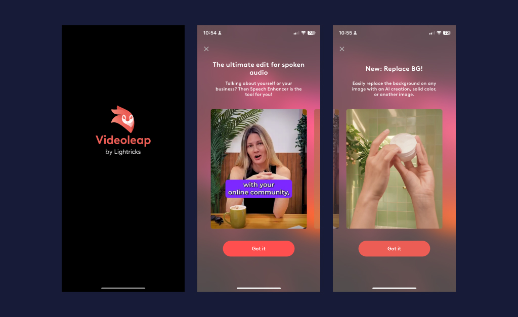
You probably encounter this all too often: that series of screenshots wedged between launching an app and starting to use it. Slides excel at providing a quick overview of what’s new and are a great place to inject delight — but they’re focused on showing and telling rather than doing. Since users are blocked from getting hands-on experience with the product, there’s a high likelihood of quickly forgetting or simply ignoring them. So, if you do decide to include welcome slides, remember these tips: Keep them to a minimum, only highlight what’s important, and supplement them with more hands-on learning opportunities inside.
Video Tutorials
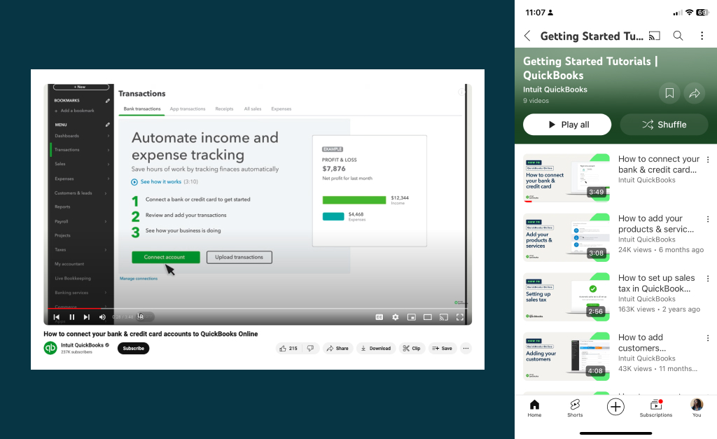
As long as you’re not filming actual people, video walkthroughs are a medium-effort way to help users out in the long term. Common tasks — like creating a new template or exporting records — are ideal subjects, and this format gives users a handy reference when they need it (unlike other onboarding methods, which tend to disappear). They do take a bit of time to make, though, so frequent UI updates can render a large library of videos useless.
Tooltip Tour
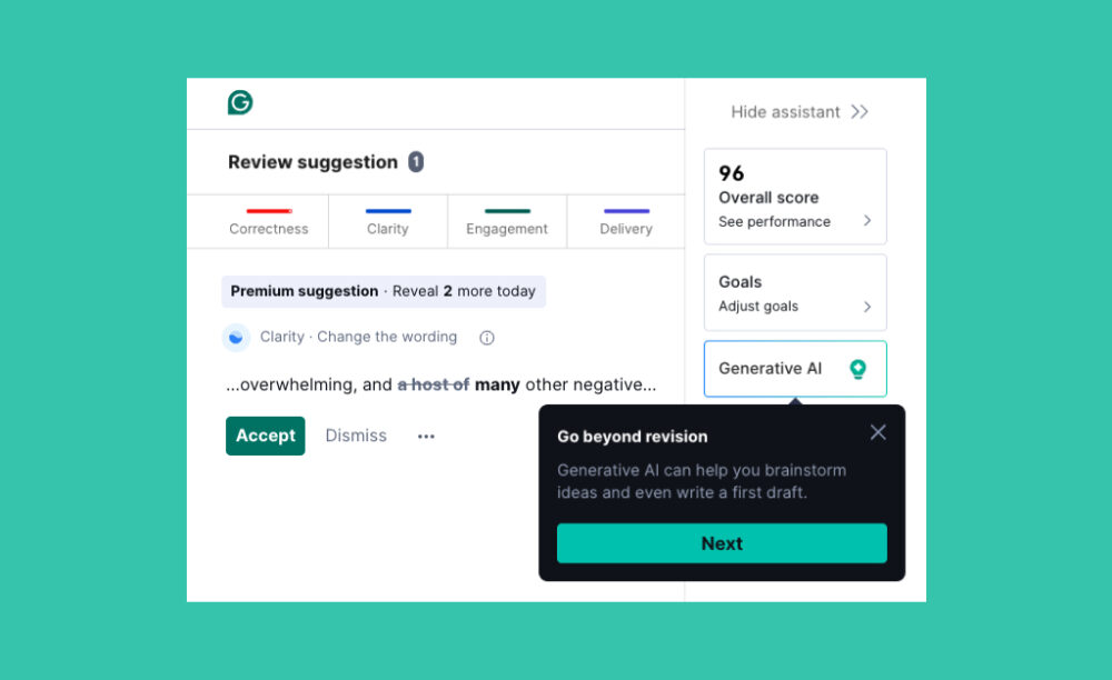
This approach guides users through what’s most important, all within the context of your app. New users are oriented to key features, power users are introduced to updated features, and so on. While not as obstructive as welcome slides, tooltips can still be seen as a barrier: avoid using too many in a sequence (more than three or four is pushing it), and make sure there’s a way to skip the tour altogether.
Interactive Tutorials
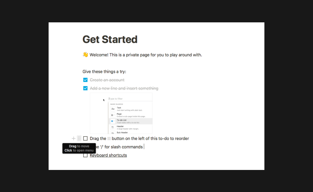
Injecting a bit of gamification, the last method adds interactivity. Rather than just point out features, these tutorials create a to-do list that compels users to actually give them a try. The learning by doing approach helps with retention and gives designers another opportunity for delight. As with the tooltip tour, though, these should usually be skippable.
Make it an Event
You’re your best cheerleader, and tech’s no exception. I’m sure we all still vividly remember the buzz around Apple’s first iPhone keynote. And who can forget “Developers, developers, developers?” What better way to celebrate a release than inviting a few thousand of your closest friends and fans to join in on the fun.
Luckily for us, technology has made putting on a show easier than ever. Gone are the days of needing a large venue or fancy stage. Now, with a bit of planning and a stable web connection, you can reach the masses.
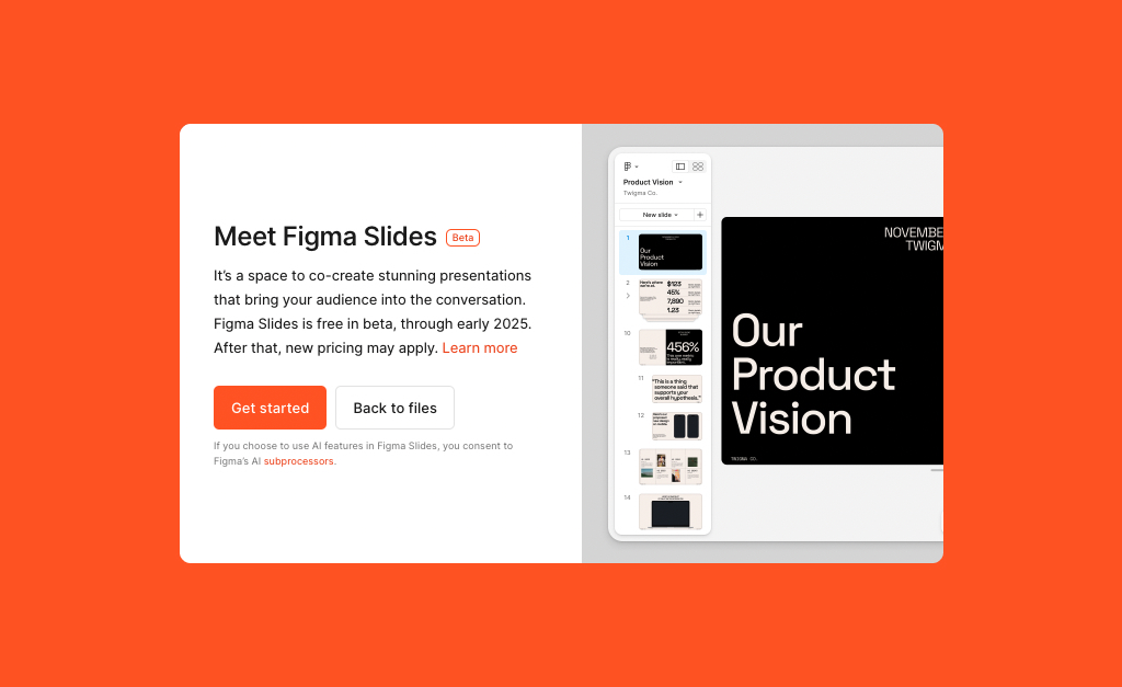
The collaborative design tool Figma has mastered the new feature rollout, and FigJam (their online whiteboard) had a multi-touchpoint release that exemplified this. Paired with a polished product, users were greeted with a blog post introducing the product and why it was built, fun social media content, and an extensive YouTube library of tutorials for future reference. What’s more, Figma consistently makes it clear through its messaging that they’re plugged into the communities that use their products and understand what they need.
Acknowledge and Iterate on User Feedback
Think work ends after a new release? Think again my friend, for this is only a new beginning. Take a quick breather to celebrate a job well done (you deserve it!), then gear up to get back to work. With anything new, users will always have opinions. The most important steps at this stage are 1) encouraging and acknowledging feedback and 2) actually acting on it.
Interface updates are an inevitable part of the product life cycle. Pleasing all users is challenging but with consideration for their needs and a thoughtful plan of action, you can help them hate changes a little less.
Up Next —
How Organization Size Influences Developers’ Decision-Making
The right tech decisions for a small and large company simply aren’t equal. Learn about how scale plays directly into software developers’ decision-making.
Read this Article →
