Designing Links: Tips for Implementing a Fundamental Piece of the Web

Article by Ben Stankich — Jul 25, 2023
Links are a core interactive piece of the web. Alongside reading, scrolling, and typing, they’re ingrained into the way we use every site. Think about it: How did you get here? By clicking a link. And how did you get to the page before that? Links, all the way down.
Yet, even though they’re responsible for making the Web a web, links rarely receive a matching amount of design attention. Link styles are treated as a solved problem, with designers focusing their care and attention on snazzy animations, card layouts, and typeface selection. Yet, broken patterns — think of all the “Click Here!” links and pages opening in new tabs — highlight the need to treat links as first-class citizens of our design systems. A good design system will consider the link element’s unique properties and define an approach for clear interactivity.
What’s In a Link?
Flexibility is a likely contributor to bad practices surrounding links. From text to images (raster, vector graphics, logos), icons, and even your favorite CSS-only shape — just about every element (or groups of elements) can be linked.
If virtually anything can be a link, how do we let users know what is and isn’t one? How do different input devices (e.g. touch, mouse, keyboard, screen reader) impact that guidance? To answer these questions, we’ll start at the beginning.
In HTML, every link is denoted by an anchor tag (“a”). Browsers come with a standard stylesheet (called the user agent stylesheet) that gives links their well-known default: underlined and blue. Browsers all follow this same pattern, and users’ familiarity is something we can use to our advantage.
Create a System (Within a System)
Familiarity comes through consistency. When it comes to visual design, aim for a similar approach to all links and other interactive elements (buttons, inputs, etc.).
On the individual element level, consider context. Links can play any number of roles, like general navigation, stepping through a process, linking to supplementary information, or serving as the big call-to-action. A link’s placement within layout, content hierarchy, and even neighboring colors will contribute to its functionality and accessibility.
Stand Out (Just a Little)
Now, onto specifics. Let’s first consider the normal, default link: a bright blue color that contrasts with its surrounding text. It’s a classic, and a great place to start.
Pick a high-contrast color to reserve for use with interactive elements. Remember that consistency and repetition are the ticket here. This goes for all of the possible states, including:
- Hover and/or focus (which we’ll simplify to hover from here on out)
- Our under-utilized friend, visited
- Disabled (which comes with its own suite of issues)
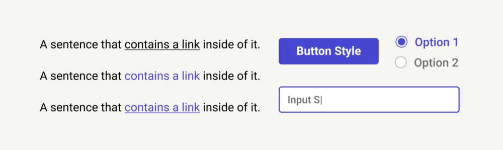
Color is a useful indicator, but adding the tried-and-true underline helps reinforce the idea. If you go this route, keep it unique to links: Underlining other elements will only create confusion.
Nail the Default State
Designers love a good hover state. Discovery and delight are fun for them, for the user, and an easy way to add some polish. These days, though, touch devices make up a majority of web usage, dealing a pretty tough blow to our hover states (though, VR devices may be exciting territory for hover-like interactions). Since we can’t rely on mouse-based interactions to indicate what is or isn’t a link, the default state becomes even more important.
In other words, hover styles should be supplemental to the default styles that work across all devices. Their goal is to reinforce which elements can be clicked, tapped, or triggered. They enhance what’s standard.
If you skim through a page, can you tell (with reasonable certainty) which elements are links? If not, you may be relying too much on supplemental states.
More Links = De-emphasized Design
Devices are one thing, but the context of the link itself has to be taken into account. Websites are rife with densely-linked sections: navigation, footers, menus, lists, and even tables. Typically, links should stand out from the surrounding content. But if the surrounding content is mostly links, we need a deeper ruleset.
Time to create a new link style. Instead of a long list of brightly colored links, the default text color with an underline may suffice (like links in this article). Or, instead of underlining every link in a list, rely on color contrast to set them apart.
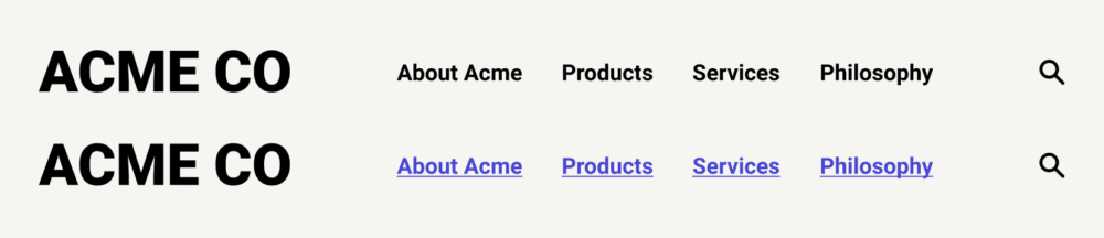
There are a number of UX patterns at play here, but the big one is proximity. Navigation and footers have distinct placement and usage, so users intuitively understand they contain links — even if the link design varies.
Linking a Group of Elements
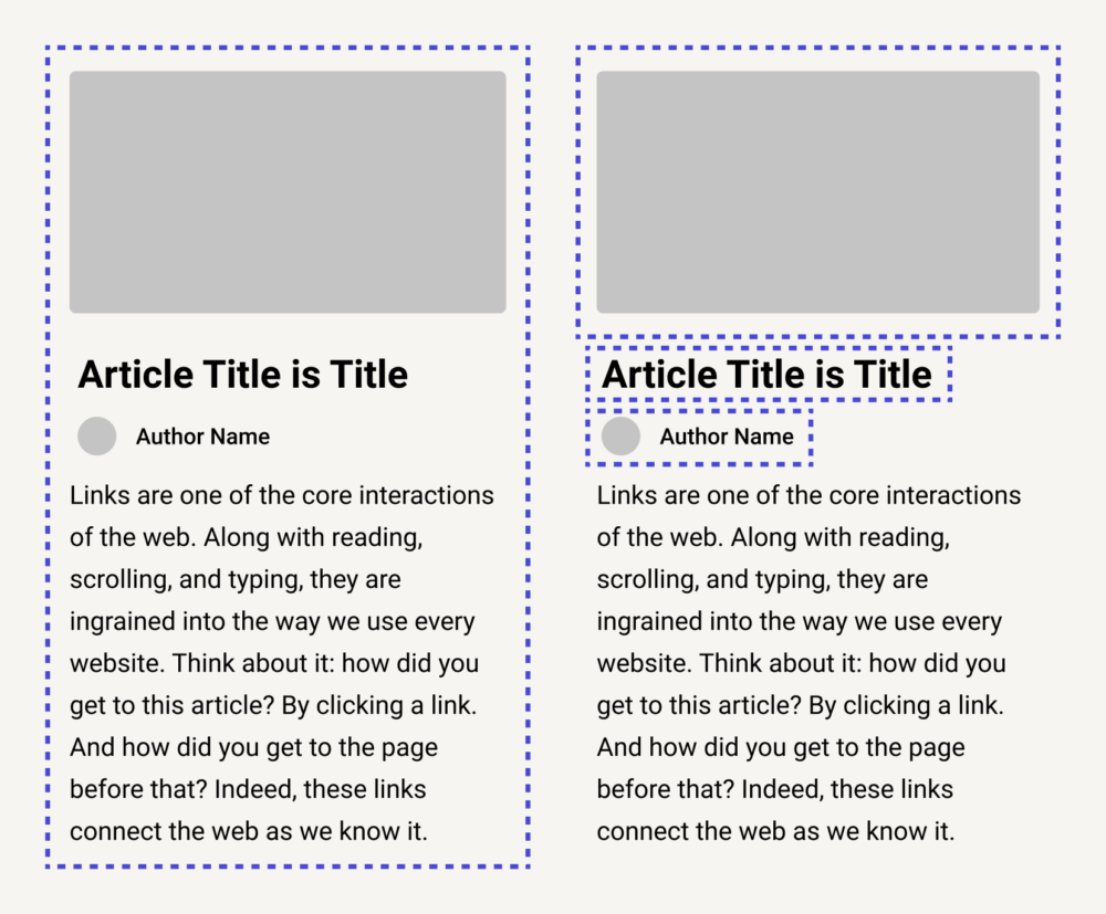
We’ve talked about text, but links can also encompass a group of objects. It may be an icon + label combo, an e-commerce product, an article (title, image, lead text), or any number of elements. How are these groups styled, and how do they behave?
First, resist the inclination to wrap all these elements in an anchor tag and call it a day. When an entire section becomes a link, users may lose meaningful interaction with its contents (like text selection), proper screen reader support, and the ability to put more than one link in a group.
A more nuanced approach is selective linking. Consider linking only what the user is likely to click on, such as the title or main image. The entire section (excerpt, author, date, etc.) doesn’t have to be linked (or may link somewhere else). This approach doesn’t have strict rules, but is guided through mindfulness of user intent and typical behaviors.
Many content pieces benefit from being paired together, such as a blog author’s name and photo, or a product image and its title. Front-end tip: The relatively new :has selector in CSS allows complex hover styles to be paired up for related-but-separate elements.
Optimal Target Sizes
Remember to have appropriately sized click/tap targets for interactive elements. As a user, it’s frustrating to click just outside of the element boundaries and miss. Giving a bit of leeway ensures that extreme precision isn’t necessary (and helps with accessibility).
There’s a sweet spot for click target size: something big enough to make clicking or tapping easy, yet small enough to avoid accidental clicks. That last bit is important — there’s a point at which a button is too big, and unwieldy on smaller devices.
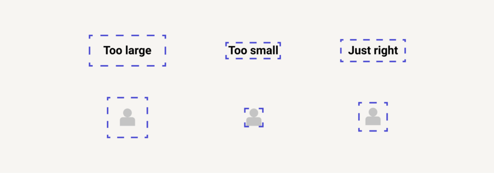
On mobile, click targets commonly take up the entire screen. Whether the screen is filled by an ad, image, or otherwise large link, it can be hard to find a place to scroll without accidentally triggering a tap. Layout shift only compounds the issue, especially when pairing a small device with a spotty connection. Careful curation of link boundaries can help reduce these issues.
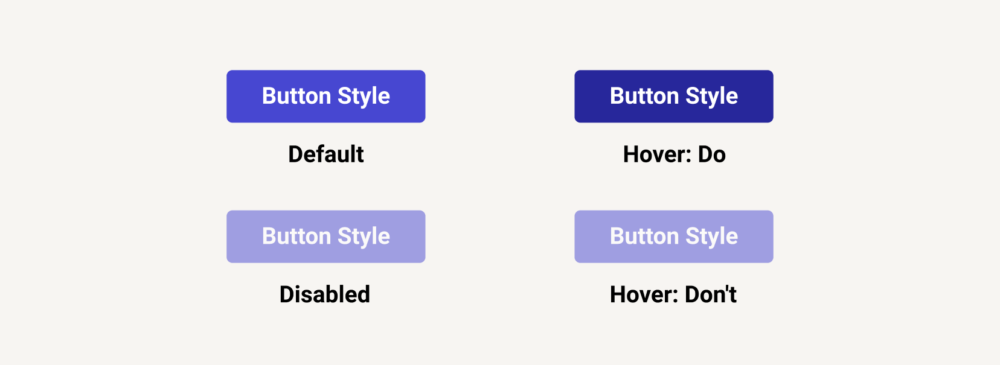
Darker? Lighter? Beware the Disabled State
It’s pretty easy to make an element more transparent on hover and call it a day. It’s visually interesting, performant, and can be uniformly applied, after all. But making an element transparent makes it appear less interactive, not more.
In interface design, a button is often made transparent to signify that it is disabled or inactive. It retains its place in the layout, but screams: “Don’t click here; I won’t do anything.” Applying this pattern of transparency to actual, live links is a dangerous approach (regardless of ease).
Consider whether elements should get darker or lighter when they’re “active” — and be prepared to reverse that idea for the opposing dark/light mode. All while making sure the new state is acceptably accessible, as far as contrast goes.
Create a Consistent Experience
An entire article on links, huh? Yep, they’re that important. Keep things accessible, avoid surprises, and don’t use “click here.” Consistency is 90% of the battle.
The best test is putting the application down for a while. After a break, try using a site on a number of different devices. If you have any errant clicks or try pressing a link that doesn’t exist, those woes are worth revisiting.
Up Next —
Developer Repellent: Scenarios That Make Us Squeamish
Software development is full of potential roadblocks. Discover the most common situations that stall developers and gain strategies to avoid them.
Read this Article →
