3 Design Exercises to Drive Your Software Discovery Process

Article by Ayana Campbell Smith — Oct 18, 2023

Software starts just like most contracted projects: information gathering, mapping needs to best practices, and surfacing the hard stuff. We (like many other digital agencies) call this exercise discovery. By the time discovery is over, everyone on the team should have a clear idea of what’s being built, how it’s being built, and who it’s being built for.
In practice, that means asking a bunch of questions, reading documentation, researching, and asking even more questions.
When it comes to interface design and user experience, though, some answers are harder to come by. Which features should be the most prominent? What style are we shooting for? What feelings should be evoked? As a verbal exercise, it’s tricky to consider and narrow all of the possibilities.
The good news? We don’t have to play 21 (or 100) questions the whole time. As this article’s title promises, let’s talk through some design-specific exercises that tackle unknowns from a different angle.
Why Add Design Exercises?
We’ve already called out that design preferences are tough to articulate. Bright or subdued? Dense or airy? Playful, serious, or somewhere in between? We’ll find the answers along the way, but that isn’t the only thing an exercise-forward design discovery is good for. Here are a few additional benefits.
Treat Design as a First-Class Deliverable
Creative needs a seat at the table. While it’s tough to quantify monetary returns on design time, it’s typically much cheaper to fix an experience before developers build it. A bit of budget in discovery:
- Helps cut down on rounds of feedback later
- Focuses effort on the right places
- Visualizes the bigger picture for the whole team
Break Up the Day With Interactivity
Lunch and restroom breaks aren’t enough to break up the sleepy monotony of really, really long information-gathering sessions. Fortunately, the exercises we’ll cover help keep engagement up — without sacrificing productivity.
Hear From Everyone on the Team
In an open conversation, certain personalities and roles steal the spotlight. Insights are lost to a fear of speaking up, or deference to leadership’s opinions.
Exercises aren’t a perfect way to level out collaborative input, but they get much closer than a free-for-all.
Exercise #1: Dot Voting
What’s absolutely necessary for your product to succeed? What should receive the most design and development attention? Here’s a sample of common answers:
- At-a-glance summarized data
- A configurable user experience
- Gamification and competition
- Live; a feeling of immediacy
- Insights unique to your organization
- A power-user-ready interface
Out loud, all of those things may sound pretty important. There’s that old adage hovering around, though: If everything’s a priority, nothing is. Our first exercise is all about focus.
How Dot Voting Works
You’ll want 7–10 high-level goals, prepped from project requirements, pre-meeting conversations, and the day’s discussions. They should be measurable, but not yet — you don’t want “an interface that’s 50% faster for current power users” to influence voting because someone doesn’t think 50% is the right target. Write the goals on large pieces of paper (or similar) and attach ‘em to an easily-accessible wall.
From there, give everyone in the room 3 stickers (these are the dots in dot voting). Participants head to the wall together and “vote” with their stickers. If there’s something a team member feels particularly passionate about, they’re free to cast multiple votes on the same goal.
Afterwards, it’s time to discuss the results.
Benefits Behind Dot Voting
Based on what we’ve talked about so far, some of dot voting benefits should sound familiar:
- Each goal (and, by extension, effort) now has a ranking
- Designers have an idea of what to highlight and promote visually
- Everyone had a chance to “voice” their opinion
- We have the beginnings of success metrics for the project
- Anything surprising makes for a great discussion
Prioritized goals are a guiding light for the rest of your project build. New features, new approaches, and anything else “new” along the way can and should be measured against these goals.
Potential Dot Voting Pitfalls
Dot voting is a super useful, well-worn discovery tool, but it still has a few potential problems:
- Nailing the initial 7–10 high-level goals takes some practice. You’ll need extra stakeholder input the first few times to arrive at the right topics (and cover everything everyone wants the project to be). Eventually, the patterns become easier to spot, meaning less back-and-forth.
- Even with some newfound independence, team members may follow the voting patterns of leadership. Consider holding certain roles or ranks back if you’re worried about copycat behavior.
Exercise #2: 20-Second Gut Check
Now we need a way to answer some of those style questions. Which colors? How bold? What kind of illustrations? If you aren’t steeped in design, it’s probably tough to pick a preference off-the-cuff — or understand if a choice has long-term consequences.
Our second exercise adds a quantitative dimension to decisions around style.
How the 20-Second Gut Check Works
The 20-Second Gut Check (or 20 Second Gut Test) uses 20-ish interface screenshots in an auto-advancing slideshow. The deck should showcase a number of design approaches: dark, light, airy, dense, fun, serious, etc. As you can probably guess, each slide sticks around for exactly 20 seconds.
Everyone gets a scoresheet and follows along, rating the screenshots from 1 to 5 (1 = wrong for us, 5 = perfect for us). The exercise is just the first step, just like dot voting; tallying the results kicks off a follow-up discussion.
Benefits Behind the 20-Second Gut Check
What does a slideshow on autopilot get us? Tricky concepts, systematized:
- Even if someone can’t express why they like or dislike something, they’re able to turn their reaction into data.
- The slides change too quickly to overthink context or consider what others will choose.
- As far as exercises go, this one fits into a short space of time.
The subsequent discussion is really where you’ll find magic. The results — and team members’ explanations — pull out the opinions and biases that ultimately drive a design. Why does illustration #5 work while #7 doesn’t? Why are the screens with bold colors trending higher?
Potential 20-Second Gut Check Pitfalls
Preparation, preparation, preparation. Of all the exercises, this one leans the most on prep:
- How good are the slides? Insights will be tough to come by if there’s a lack of obvious diversity in the samples.
- Does the team know what they’re looking at? Coming in cold, stakeholders may have a tough time relating a random screenshot to their product idea. A little coaching and a sample (untimed) slide go a long way.
Exercise 3: Site Mapping
What’s the bigger picture? How much stuff are we building? It’s easy to zoom in and call every feature a “must-have,” regardless of what the budget or timeline supports.
To that end, our final exercise deals with perspective.
How Site Mapping Works
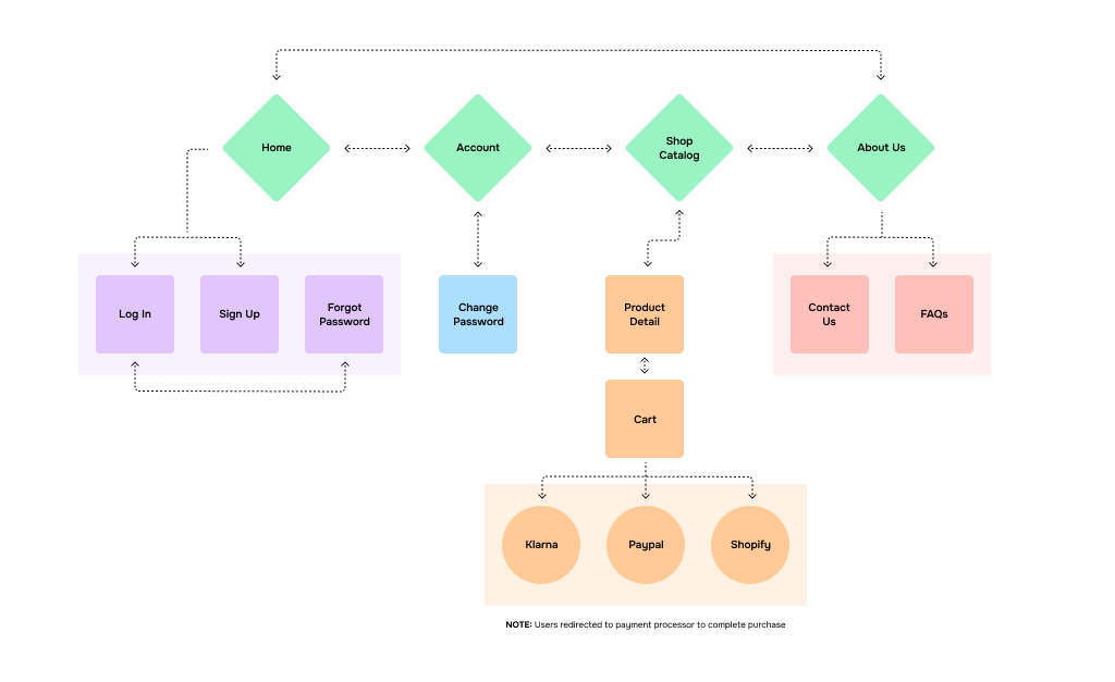
Mechanically, site mapping is super straightforward: lay out all of the application’s key pages and/or page states, then figure out how they connect together.
FigJam is our tool of choice here. Miro is also a great option, as is a tried-and-true whiteboard.
The result is a living document, and something you’ll continue to refine as discovery progresses. It’s just about impossible to nail a site map on the first try, and that’s expected. Just like our other exercises, the key is providing a visual artifact for discussion — a 30,000ft view that lends context to hard decisions.

Benefits Behind Site Mapping
You’ll see benefits from the completed map and the act of creating it:
- Teamwork. Designers are great at thinking high-level and connecting boxes, but a site map will need everyone’s input to pull off. Subject matter experts have opinions on process flow, developers have opinions on data flow, and so on.
- One page leads to another. Adding a place to sign in necessitates a place to sign up and a flow for forgotten passwords. A table of data is paired with ways to edit, delete, and add new entries. You’ll quickly see how each feature cascades in a few directions.
- The big picture. With a full map of your intended product, feasibility is an easier guess. Does this feel right for timeline, budget, and team?
- Third-party help. Visualized flows put a spotlight on features and what they touch, kicking off the always-necessary questions around build vs buy.
Further, just having a chart is a mental boost. It’s usually the first physical representation an application idea gets, giving a project a firm step towards reality.
Potential Site Mapping Pitfalls
Yep, no exercise is safe from danger. More bullet points:
- Site mapping dumps a lot of responsibility on the moderator. They’ll need to manage cross-talk, help mediate the must-have vs. nice-to-have choice, and have a command over common application patterns. If there are more than seven or so people in the “room,” splitting tasks between two moderators may be best.
- It’s easy to find complex sections of the product and get stuck. Questions that can’t be resolved quickly are really important to surface and schedule for a follow-up later.
- You’re back to managing personalities and job titles having an outsized influence over the conversation.
Creative Ways to Collect Creative Requirements
Design questions aren’t always easy to answer at the start of a software project, but (as this article has navigated) talking about design ties directly to many high-level decisions and concepts. Honestly, the creative exercise portions of discovery tend to be the most valuable — both from a distance covered and a team togetherness perspective.
Fortunately, a lot of design ground can be covered for little budget when needed. Consider giving some of these a shot for your next project or phase of work.
Up Next —
Everyone’s a Contributor: Knowing What’s Possible in Product Design
Defining a new application? You don’t need to be a senior developer to help. Everyone can contribute if you understand the possibilities. Learn more.
Read this Article →
