Refresh or Redesign? Picking the Right Path for User Interface Updates

Article by Ayana Campbell Smith — Jun 13, 2023

Your user interface — or UI, to save some ink — is a first impression and an experience. And, like software updates, bug fixes, and maintenance, UIs are a forever responsibility with a variable shelf life. When updates beckon, you’ll have to pick between a refresh (move some furniture, add some paint) and a redesign (take it down to the studs).
Let’s run through the signals for each, reasons why you’d choose one path over another, and tips to help you through those efforts.
Is it Time for a User Interface Update?
Some design is timeless, but time has a habit of degrading interactive experiences. If Amazon called it quits years ago, we’d be trying to order paper towels through this:
So, early flag in the ground: updates will definitely be necessary. We’re worried about when. Here’s a set of questions that’ll help with the answer:
Download: Is a Refresh or Redesign Right for You?
Download our self-assessment Q&A to help determine if it's time for a site refresh or redesign.
Do Your Users Match Your Personas?
Whether you went through a formal persona process or not, odds are that you had a pretty clear picture of an ideal customer in your head. How closely does that image match reality? Does it need to change, or to be reinforced? If there’s a gap between who your interface is for and who’s actually using it, some tweaks are in order.
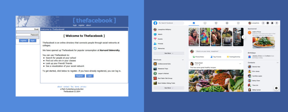
Take Facebook. Its initial some-college-campuses, desktop-only experience did the trick, but onboarding the rest of the world (and dealing with a shift to mobile) required change. Today’s design emphasizes different features, behaviors, and types of users.

What Insights are Hiding in Your Analytics?
Like personas, a fair bit of guesswork probably went into your first design pass. The second time ‘round, you’re equipped with the magic of data. Where do users fall out of the flow? What features are performing below average? Is the gap between current and potential numbers wide enough to make this an easy decision?
As an added bonus, comparisons of data before and after add a quantitative measure to an effort that often feels unscientific.
What’s Tripping Up Your Customers?
What problems are customers having on a regular basis? Are you customer service reps hearing the same things over and over? Hopefully this one sounds like a no-brainer: Talk with customers (and the individuals directly supporting them) to draw out the big, hairy, immediate issues that need consideration.
What Does the Competition Look Like?
Are you keeping up? Design isn’t everything, but an improved experience and flashy interface is an easy “in” for a competitor. Remember HipChat? Slack does.
Keeping Up with the Joneses is a maddening game to play — and compulsively looking over your shoulder isn’t good for anyone’s health. Still, you’re on the hook to keep first impressions from being a strike against your platform.
What Will the Fallout Look Like?
Hating on a redesign is a beloved internet pastime, but there are changes that push beyond the usual dislike before acceptance cycle and into full-blown upheaval. Just ask Snapchat.
When the social media giant rolled out its first-ever redesign, the fallout was swift. Stocks tanked, usage plunged, and a petition to reverse the updates amassed 1.2 million signatures from unhappy users around the world. Eventually, Snapchat pushed out a series of updates to cover the biggest concerns.
When Will the Updates Arrive?
Carrying on with the idea of fallout, when should the updates hit the market? Assuming your product is an important part of someone’s day, poorly-timed releases can sink a reputation. Rolling out a redesigned version of tax software in the US on April 14th, for example, isn’t a great plan.
Pick a Path: Refresh or Redesign
With questions of timing and need all squared away, now it’s a matter of refresh vs. redesign. Are you in the market for a can of paint, or should you break out the sledgehammer? Each has a place — and an impact on things like budget and timelines. Let’s take a look:
Refresh Your UI With a Coat of Paint
Updated fonts, revised color palettes, some new icons: A refresh breathes some new life into an application without sacrificing familiarity.
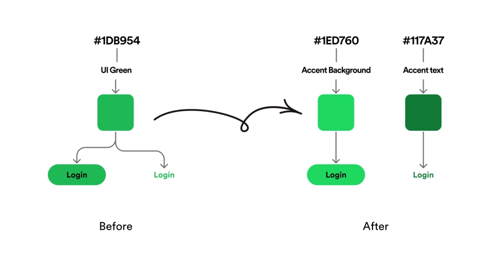
It’s like keeping up with Spotify’s interface since the introduction of their design system, Encore. There’ve been some general layout updates (where’d the search bar go?), analytics, new tools, and tweaks for contrast, but the feel is still there.

Consider a Refresh When
- Feedback from customers is still mostly positive
- You’re on par (or better) than competitors
- The design team doesn’t make an audible noise whenever there’s a change request
- Identified deficiencies would take days or weeks to fix
- Your developers are limited on time
- Change feels overwhelming
Rebuild Your UI’s Foundation
If you’re familiar with technical debt, the same sort of thing creeps in on the design side, too. “Temporary” fixes, half-baked solutions, and features never meant to coexist are all duct-taped together into a Frankenstein-esque mess that everyone’s afraid of. Sound familiar?
Some structural issues can’t be resolved with a coat of paint. A redesign is invasive, costlier, and more time-consuming, but it may be what’s really needed — an opportunity to bridge where the application started, the present, and the future roadmap.
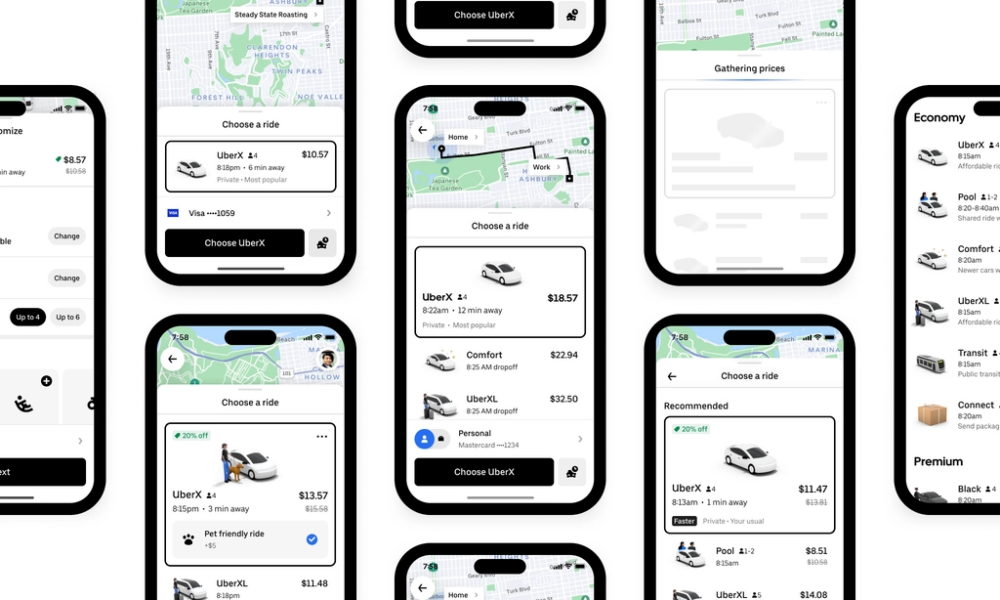
Uber covers a lot more than ridesharing these days (food, scooters, flowers, and the like), and their redesign rethinks the marriage of those services.

The new interface makes use of new iOS features, simplifies discoverability, and unifies users’ profile information. It was a big undertaking, but one that would’ve been impossible in small steps.
Consider a Redesign When
- It’s been several years (3–5 or so, but it varies) without a major update
- Your service offerings and/or customers have changed
- The interface has become a punchline at meetings
- Designers seem to take a long time just to get started on changes
- Multiple weeks or months are needed to handle deficiencies
- At this point, you’re not worried about change at all. Just fix it
- Stakeholders are ready to be involved and offer prompt feedback
Tips ‘n’ Tricks for an Update
Now that we’re on the right path, here are some pointers for following it:
Before Tweaking Your Interface
- Loop in the development team. Whether it’s a matter of time, scope, or specialization, make sure developers are involved early and often. If they can’t pull off the new direction, it’s dead in the water.
- Define your goals. Design often feels subjective, but its effect can be measured. Are you looking for increased engagement? A reduction in helpdesk tickets? Faster changes? Setting benchmarks gives the team a chance to optimize and prioritize their work.
- Review what’s working well. Updates to the interface aren’t all about change — not hurting the good parts is key, too. Identify what’s working, protect it throughout the process, keep an eye on the data after, too.
During the Design Effort
- Test and iterate. No, we’re not talking about Google’s 50 shades of blue. With the right testing setup, though, you can start optimizing for those last few percentage points of value.
- Keep users in the know. Your interface may be really, really important to a lot of people, and transparency goes a long way. Release notes, social efforts, blog posts — any sort of communication helps smooth change. Dribbble nailed this with an article that dove into objectives, direction, and the visuals to match.
- Keep the team in the know. Customer support is directly impacted by the UI too, and communicating the why and what is just as valuable here. They’ll need to carry the torch during a (potentially tumultuous) revamp.
- Avoid different for the sake of different. Shiny. New. We all fall into the trap. Keep an eye on the actual objectives and keep people who give honest feedback in your sphere to avoid different just for the sake of it.
After Rolling Changes Out
- Be receptive to feedback. Not every complaint will be worthwhile, but some feedback will be super valuable. Software tends to be large, complex, and used in a ton of contexts; there’s inevitably something or someone you’ll miss along the way. Hotjar’s approach to ongoing feedback is an example of an extra net for things that fall through.
- Plan for regular updates. It’s easier to clean a house regularly than to do it once a year. Your interface is now a living thing that needs maintenance, care, and attention, and tasking someone — even part time — helps avoid the really bad grime.
Tackling a Live Interface
Refreshes, redesigns: both are daunting, and both introduce change to a system that’s probably been successful so far. Stay proactive, because a revamp will only get harder with time.
During, there are two tenets to keep in mind:
- Measure. Before and after
- Communicate. With customers, your customer-facing team, and the folks doing the actual implementation
Up Next —
A Bad Design System Is Worse Than No Design System
A bad design system affects every aspect of your software development strategy. Learn what causes a design system to go bad and how to course correct.
Read this Article →
